All brands have a story to tell...the compelling reason that they came to be, the inspiration that planted the seed...the aspiration that drives them forward. Branding Design is distilling that essence—that energy and inertia—into a tangible (and hopefully impressionable) statement about a company and its products.
A logo brandmark and packaging are extensions of Branding Design— both are visual touchpoints put out to a target audience in hopes of engagement. They form opinions in the minds of consumers about a product its source, therefore it's important that Branding Design be true to the company's core values in order to gain consumer loyalty.
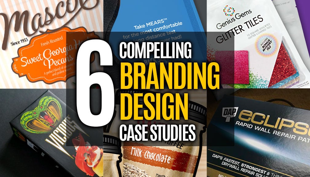
Below are 6 compelling Branding Design Case Studies that Catalpha has had the opportunity to develop.
______________________
MASCOT
CANDY PACKAGE BRANDING DESIGN
Brand longevity and refresh
Three years ago when the largest buyer and seller of Pecans in the US came to us, they were looking to move from wholesale to the retail market and wanted a new package design for their four top selling products. This would be the beginning of their brand journey into retail and the start of a successful client/agency relationship that continues to this day.
The brand back story
MASCOT Pecan Shelling Company is a proud family owned company that was founded in 1955. Over the years they have expanded their operation from just nuts to include a large variety of candies and snacks. They were already selling a line of these products under SCOTT’S, a fundraising division.
They pride themselves on their homemade, small batch, original recipe products, made in the USA, and were clear that this new retail line must reflect their history in the brand graphics and copy.
The Mascot brand evolution
Our first projects
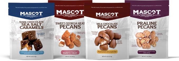
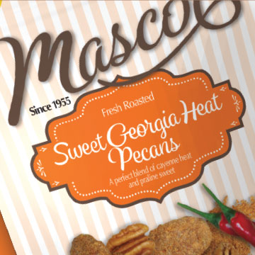
Our initial project was taking their top 4 sellers from wholesale to retail. A package design was created that was centered around their history. It incorporated their existing Scotty dog logo and a historical shot of their first, original storefront location. Differentiating the various flavors through color guaranteed the choices would be evident on the shelf.
 |
As the brand grew in popularity and their product lines expanded, Catalpha was asked to redesign their packaging again. This involved a logo redesign to maximize the MASCOT name and strengthen their position as a snack company. The Mascot Scotty was simplified and reworked for brand name prominence. The package design also went through a redesign to strengthen brand visibility. Highlighting the breadth of the product line was achieved by the color badge at top of package. These colors create a bold backdrop to pop the brand and help differentiate between product flavors. The color pallet was expanded as new candies and snacks were developed and brought to market.
 |

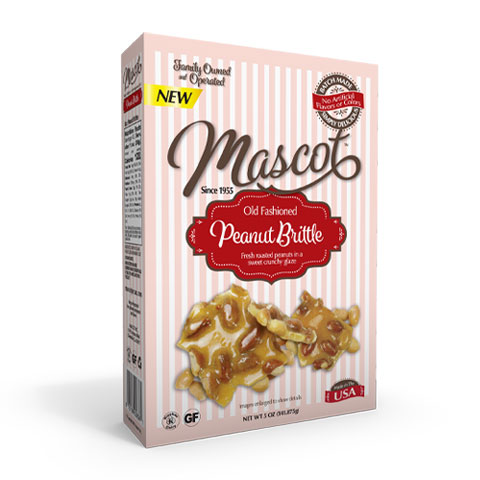
Today— what’s old is new
Moving forward without forgetting the past
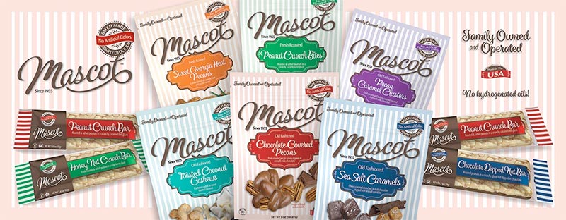
Through successful marketing and brand consistency, MASCOT has seen tremendous growth in the retail snack arena. We have had the opportunity to work closely with the client in evolving the brand through this success in the retail market. It became very apparent that part of the popularity, aside from their unique and substantial product offerings, was Mascot’s family-owned, small batch commitment that has stood the test of time—without shortcuts in quality or consistency.
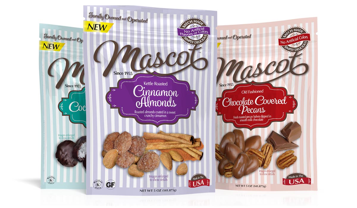
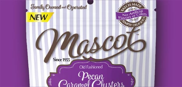
Using the feedback received from their buyers, distributors and marketing team, Catalpha redesigned a new logo and created a striped packaging reminiscent of candy and confection bags from centuries ago that pays homage to their proud history with a nostalgic yet fresh, appealing look.
A look at the branded elements
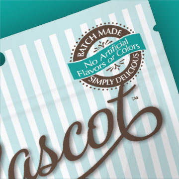
Not to be missed is the redesigned Mascot logo. Gone is the Scotty dog, a decision that was not taken lightly, but now gives the Mascot name full domination.
Featuring a modified script font in a signature chocolate brown, the logo flows with a sweep like chocolate drizzle dominating the top of the packages.
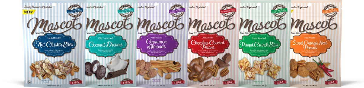
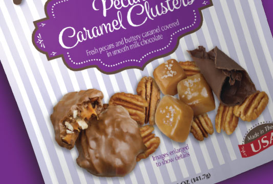
The distinctive striped design gives the packaging a nostalgic look with the color pallet carefully curated to give each product category its own distinct look.
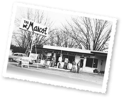
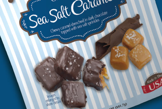
Vintage graphics and text treatments, like the “Batch Made” icon, work to build the brand format of a fresh take on nostalgia. The photo of the original MASCOT building from 1955 remains on the back of the pouch, along with a photo of the current facility—a nod to their 60+ years in business and the 3rd generation management.
 |
 |
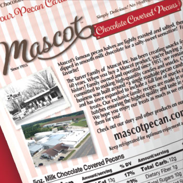 |
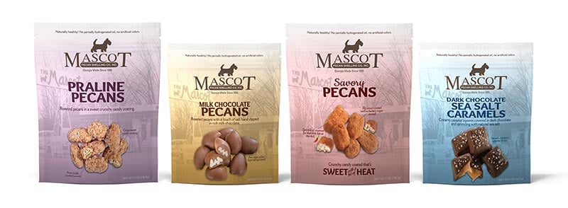
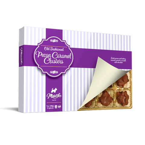
Catalpha custom photographed the snacks so the mouthwatering products are front and center – to draw customer in. Key ingredients are incorporated to support the message of small batch and hand made goodness. Not to be missed, the front of package is anchored with “Made in the USA” icon.
 |
 |
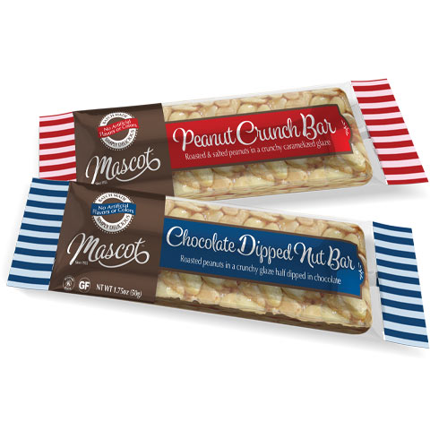
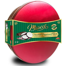
The new brand is being rolled out across Mascot’s entire product line from store displays to seasonal and gift items.
 |
 |
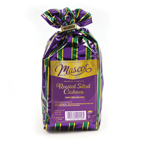 |
| Nut Bars | Holiday Tins | Bulk Bags |
 |
 |
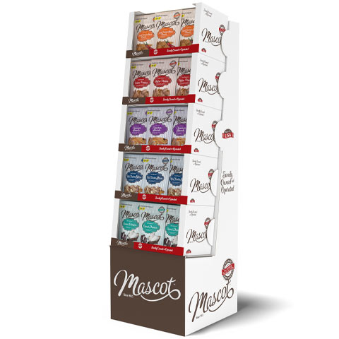 |
| Peanut Brittle Packaging | Chocolate Gift Packaging | In-Store POP Displays |
Brand refresh is a major investment – not to be rushed into. It requires a strategy that is founded on facts and a total management buy in and support from you retailers. Without question the brand must know their competitions and the shelf. Catalpha has a proprietary process that helps evaluate individual brands situations and opportunities. If you are considering a revising your brand don’t miss the opportunity of asking our experts advise and insight.
______________________
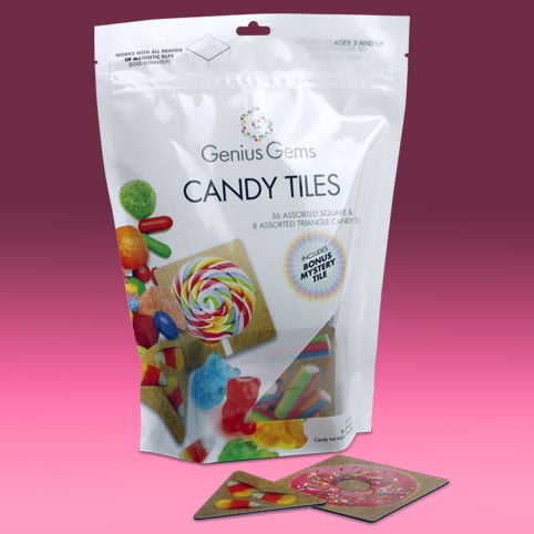
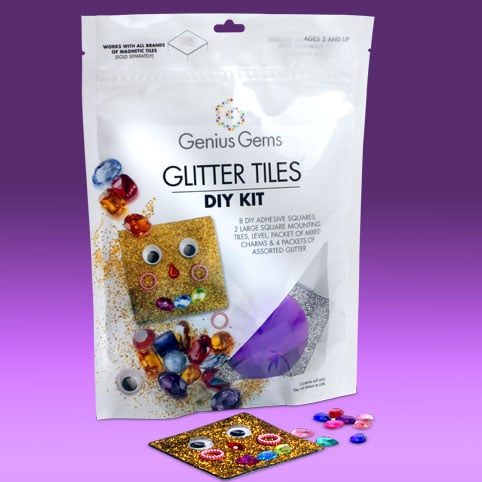
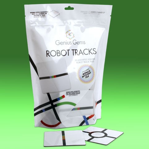
GENIUS GEMS
EDUCATIONAL TOY PACKAGE BRANDING DESIGN
The Genius Gems back story
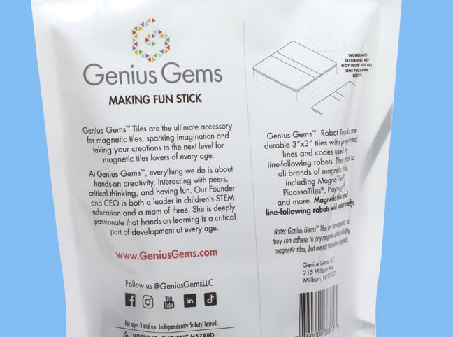
Genius Gems, founded in 2013, excels to enrich kids lives by learning through play. With on-site camps and labs and classes, kids of all ages gain experience with hands-on creativity, interacting with peers, critical thinking, and having fun. Their STEM and STEAM-focused curriculum was developed by an experienced educator. At the center of these activities?— magnetic tiles!
Genius Gems has designed and produced one-of a kind, unique magnetic tiles that magnetically adhere to all brands of magnetic building tiles. These tiles feature printed designs to inspire magnetic creations, as well as interactive adhesive tile sets that you design and embellish. They have become such a hit at the Genius Gems campus, the owners decided to package select sets to offer for sale.
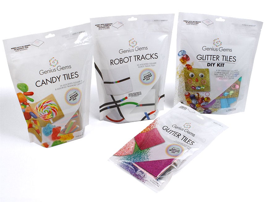
Designing branded packaging to appeal to kids of all ages
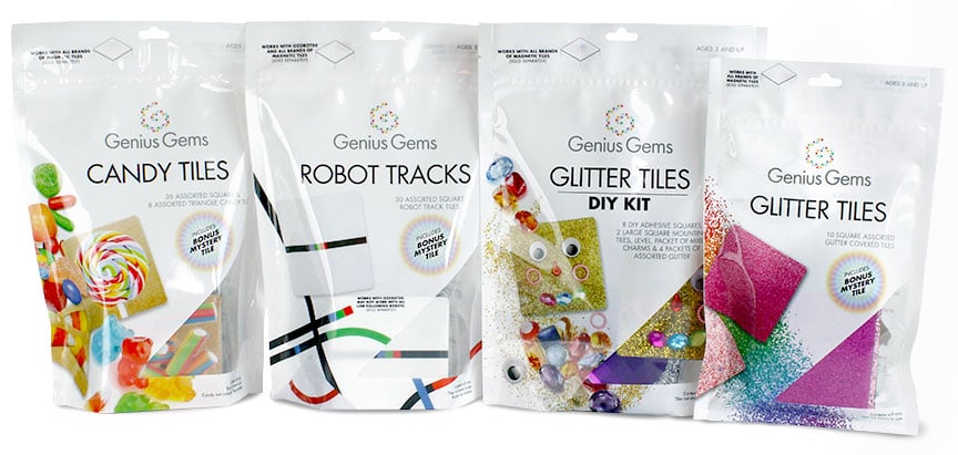
A series of bold, cleanly branded pouches were designed for the tile sets. With their educational, STEM focused purpose and diverse target audience covering kids of all ages, a brand concept was developed that is engaging without looking juvenile.
A clean white background was used to play off colorful product imagery for each tile set.
 |
 |
 |
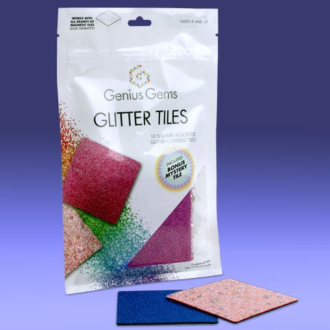 |
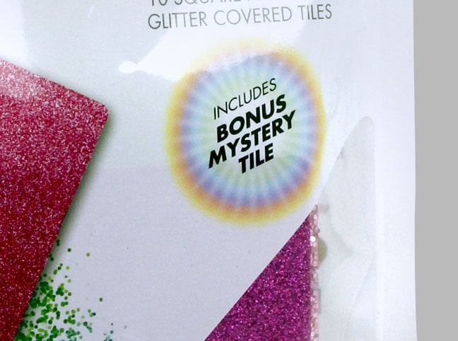
A window on the front provides a view of the tiles, with some featuring a 'Bonus Mystery Tile'— cleverly used to cross sell a tile of a different sort in each pouch.
|
|
 |
The brand design has proven to be flexible and fun, with new sets in development for future sale.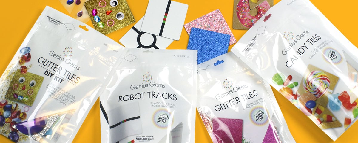
______________________
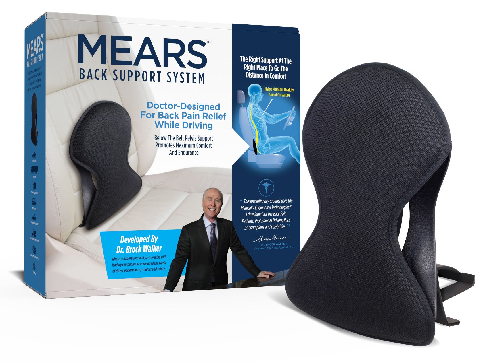
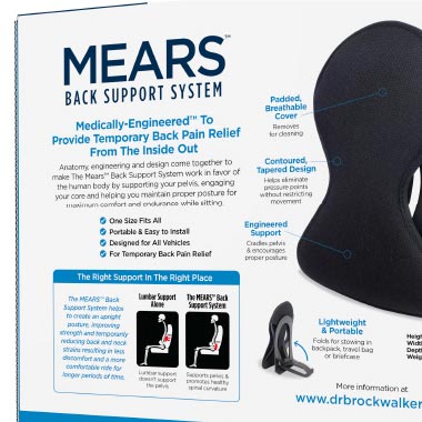
MEARS
BACK PAIN RELIEF PRODUCT PACKAGE BRANDING DESIGN
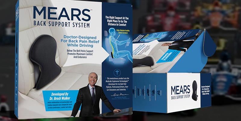
Great ideas require great packaging.
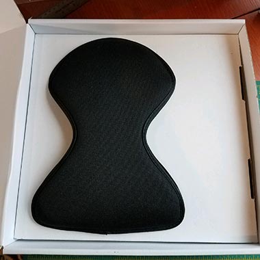
Such is the case with a revolutionary MEARS Back Support for drivers.
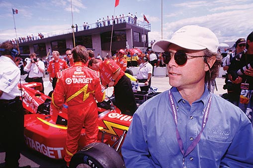
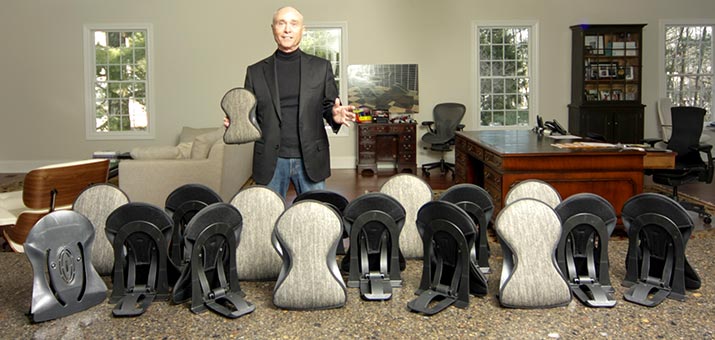
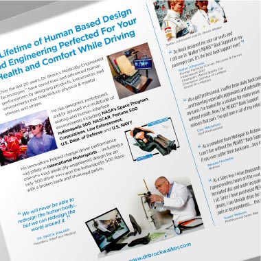
Dr. Brock Walker spent his entire career developing medically-engineered technologies that have changed driver performance, both in the professional sport racing arena as well as on a personal level. Now, based on those years of research and applied talents, Dr. Walker has developed a back support product for the average driver.
After years of development and product development, when it came time to go to market he knew his back support would require a package and brand look that backed his reputation and research.
 |
 |
He found the right packaging design company in Catalpha. Following serious discussions with owner Don Keller, an agreement was reached that Catalpha was the right fit, with the attention to detail, support and one-on-one attention this brand would require.
Our approach…
After numerous conversations, a creative brief and product development notes were reviewed we convinced Dr. Walker that not only did we need to sell his product on the package, but also his story. Dr. Walker’s breadth of experience and the amount of technology embedded in this product was key to the brand.
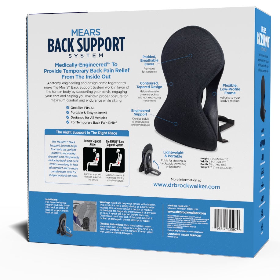
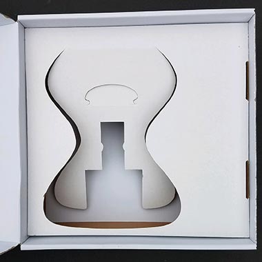
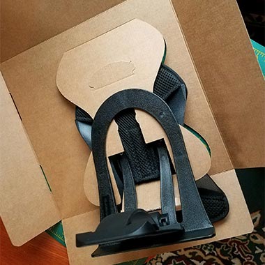
We knew that to present this product in the proper light would require more than your normal 6 sided package. We needed room to sell the story and create a user experience that backed the buyer’s purchase decision. A presentation box with a front open lid and custom designed insert was decided on.
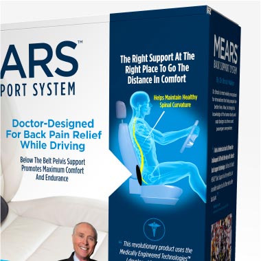
Initial presentation included several front cover concepts to display different approaches of creating a brand look and to float various product messaging angles.
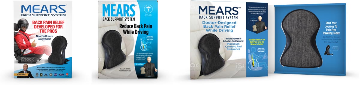
The chosen brand direction
The chosen design direction went through numerous iterations to get to the final package design. We set about doing the product photography and distilling the wealth of information to consumer-level copy points.
The way the information is presented and revealed was carefully designed to reinforce the back support’s medically-engineered benefits as well as the vast experience of Dr. Walker’s R&D.
 |
 |
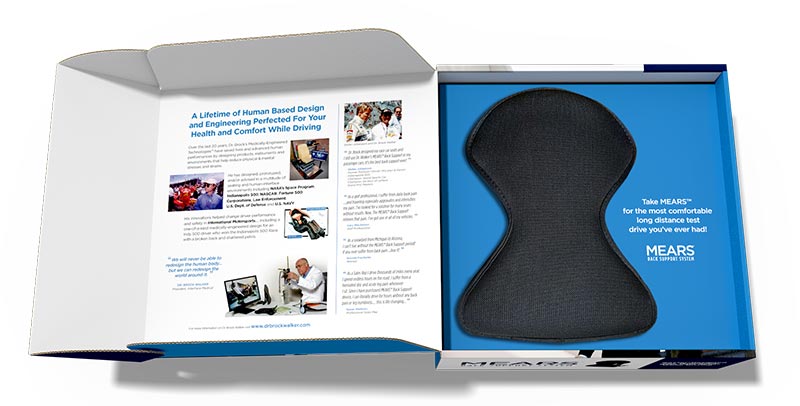
Product information, graphics and supporting facts were refined through a series of PDF proofs back and forth with Dr. Walker and his legal team. Images and testimonials from professional race car drivers drove home the merits of the product.
 |
 |
 |
We were put in contact with the client’s overseas support team who would be printing and packing the product. Catalpha worked closely with them on creating the package structure and inserts necessary to hold and protect the product. An initial two-piece inner structure from them proved to be too cumbersome and did not hold the product in place. With product in hand, Catalpha re-engineered this critical platform to be one piece, easily assembled, and locked the product in the proper position.
 |
 |
 |
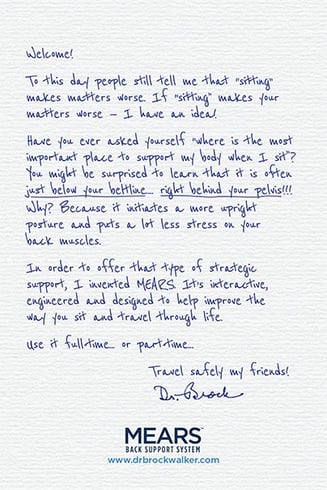
A personal note of thanks was designed to be included in the package as a final touch to the user experience.
Final words
It’s all about buyer confidence in getting a product worthy of their money. It’s about opening a package and being recognized as a brand that takes the extra step in crafting a unique user experience which in turn reinforces their confidence in the purchase. It’s also about the finding a support team that you feel comfortable working with that can deliver professional results from start to finish.
Don’t take it from us – listen for yourself Dr. Walker’s impression of working with Catalpha!
______________________
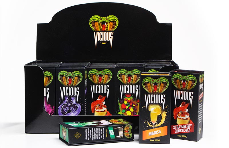
VICIOUS VAPE
VAPE PACKAGE BRANDING DESIGN
When a product category heats up and you have something to sell, you have to strike while the iron is hot. Such is the case with our client who, with an entire line of vape products, needed to get to retail fast.
The brand challenge
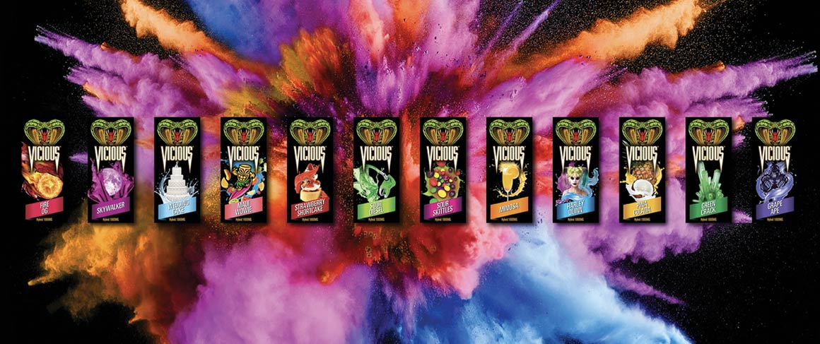
The vape product market was lit up in 2020 when we were contacted by the developer of Vicious Vape. He had an entire series of vape products that needed to get to market quickly. Catalpha was challenged with developing a logo for his brand as well as a brand ‘persona’ that would be distinct and memorable in a saturated retail space. It needed to exude premium, quality and create a buzz that would drive sales in a saturated market category.
The brand persona
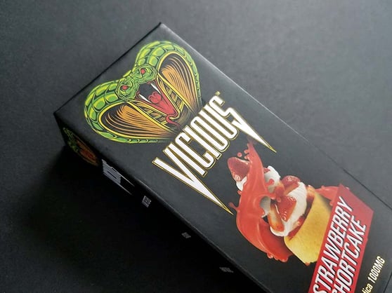
The distinct Vicious logo is crowned with a vibrant viper and a type treatment was that designed to pick up on the snakes fangs, giving it the ability to stand on its own sans the illustration and still carry the brand impression.
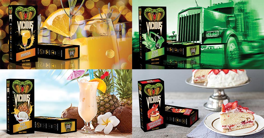
Dynamic, color-coded, mouth-watering graphics were created for each of the 17+ flavor profiles, giving each their own personality.
The Vicious Vape package
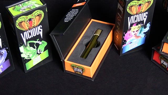
Small in size but big on impact, the package and printing techniques used reinforce the premium qualities that the brand represents. The small, rigid setup boxes feature turned-edged construction with soft-touch matte finish printing. Touches of gold foil-stamping shimmer to catch the eye give a true luxury feel. If that wasn’t enough, they feature a magnetic closure and dense black interior foam insert that cradles the product. Everything combines for a very tactile user experience.
After the brand launch
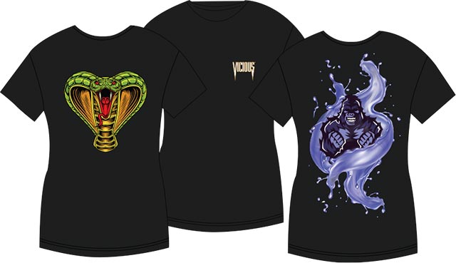
Since the initial roll-out, Catalpha continues to design new packages as flavors are developed. We produced a marketing video for social media, spun out a promo T-Shirt, and produced a countertop POP. It’s been a successful brand launch with Vicious and with a solid brand persona established, the sky’s the limit.
 |
 |
______________________
DAVE'S SWEET TOOTH
SNACK PACKAGE BRANDING DESIGN
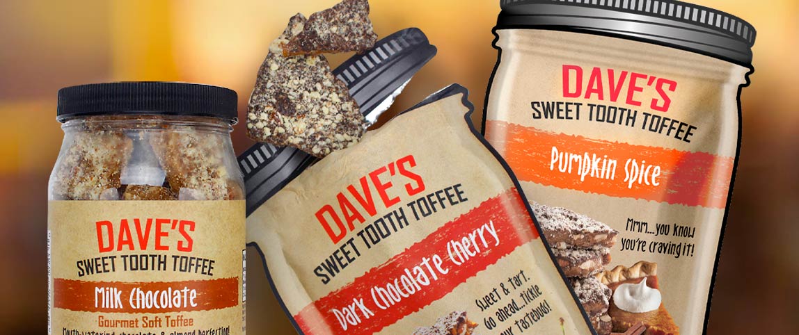
It began with one person who made some of the best tasting toffee ever. That quickly became a local favorite, and just as quickly grew to become a national brand.
Getting started
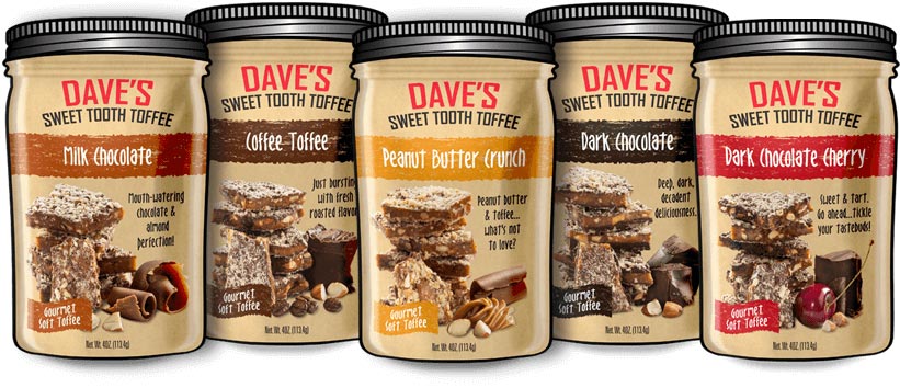
The Daves Sweet Tooth Brand had one iconic reference that we needed to build on – they had started out selling their toffee in glass canning jars. To scale their packaging efforts, they needed to switch to a convenient tear-off flexible pouch package… in the shape of a canning jar. Simply the jar graphic, logo and the flavor name.
With only a few flavors at the time, the simple iconic look worked. Things grew wild as they began adding one unique flavor after another and that’s where Catalpha came in.
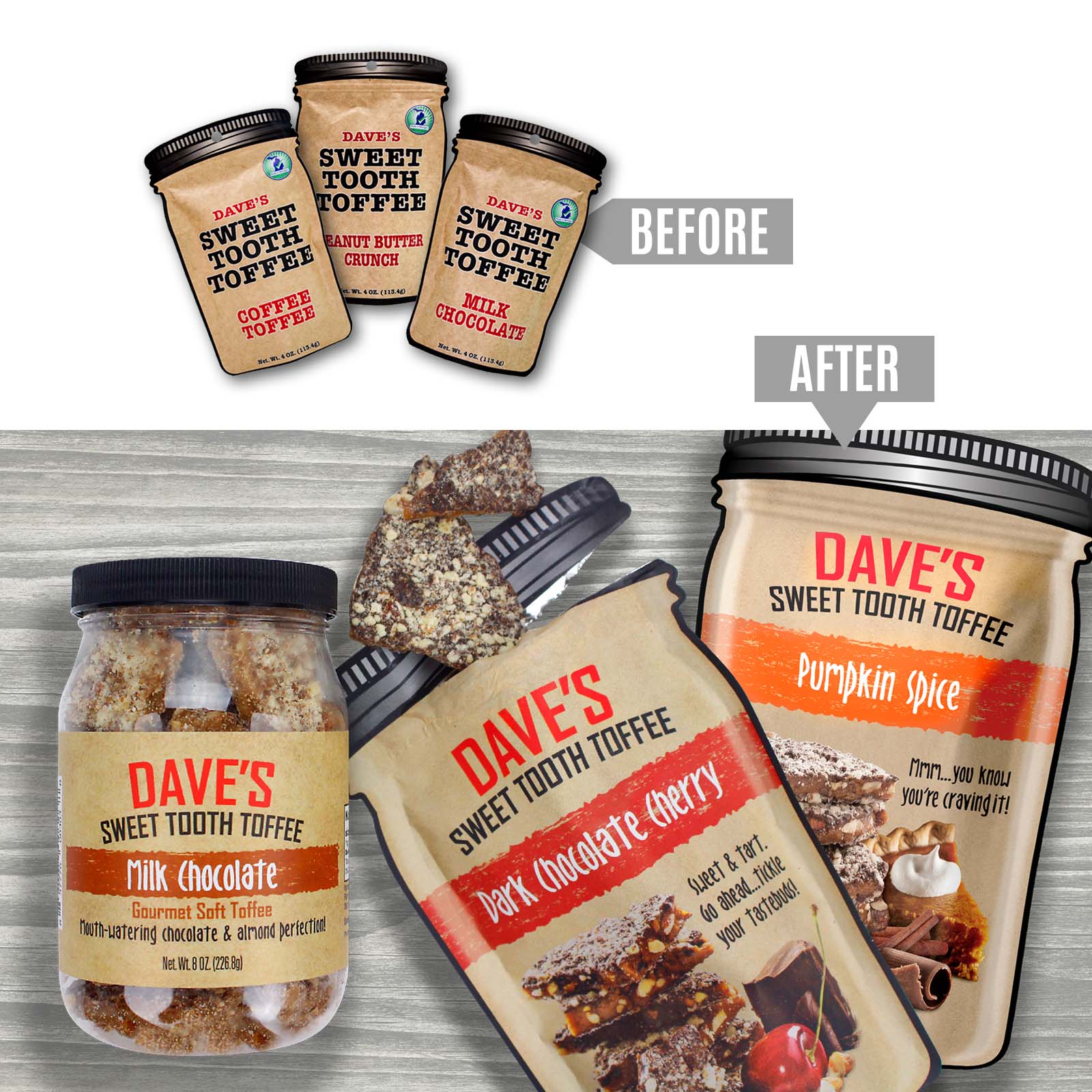
Building on brand equity
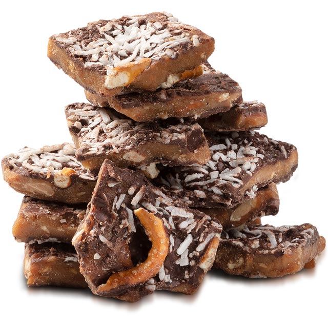
To build a family branded appearance across their flavors, we ran with the canning jar concept, but amped it up to really define the Daves Sweet Tooth Brand. The jar became more dimensional with a rustic homemade kraft look. The logo was redefined to stand out more. We had each unique flavor of toffee custom photographed alongside their mouth-watering ingredients, and color-coded banding to visually highlight each distinct flavor.
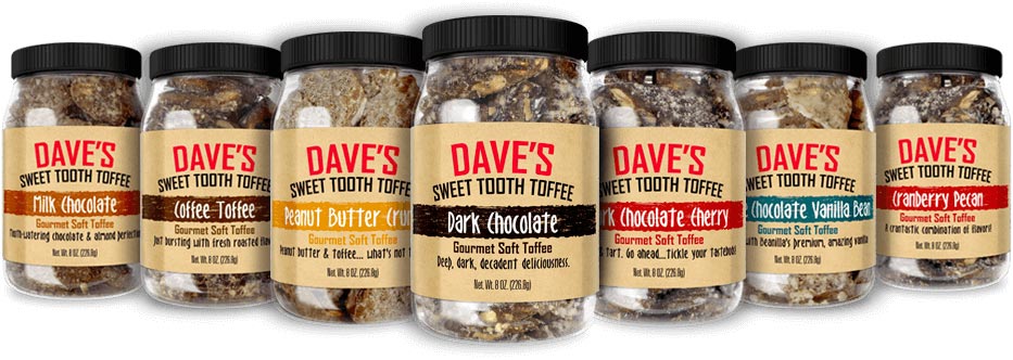 Mason jars with custom labels
 Custom stand-up pouches
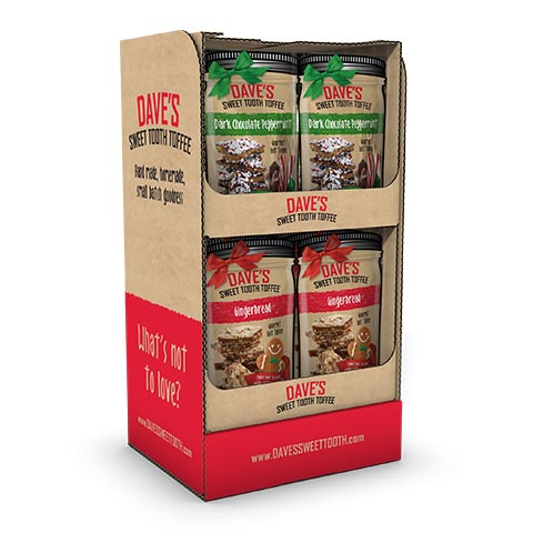
Short tower display shipper |
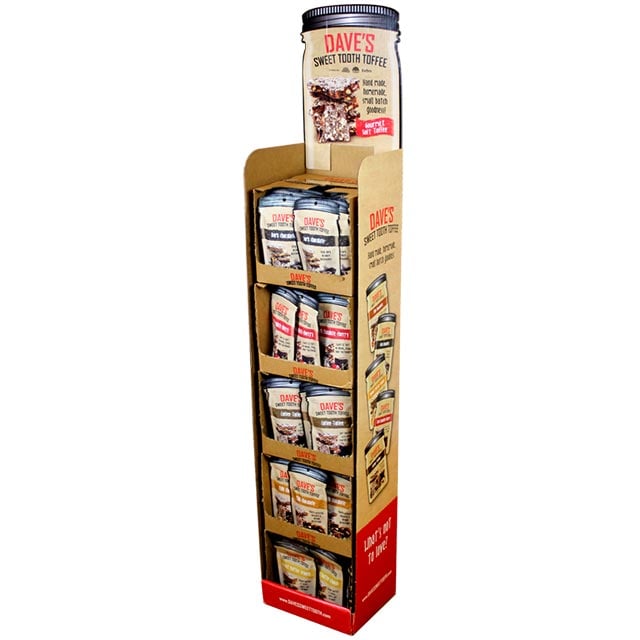 Corrugated floor display |
|
A brand follow up
Daves Sweet tooth has since blown up with online sales with new toffee flavors being regularly added. The owner ( son of the original founder) is fun to work with and we have been able to help build his brand and broaden his reach. A big bonus for him has been our custom package rendering capabilities, allowing for quick pre-production launches and flavor testing. And as he launches into retail, we have developed Point of Purchase displays and gift packaging.
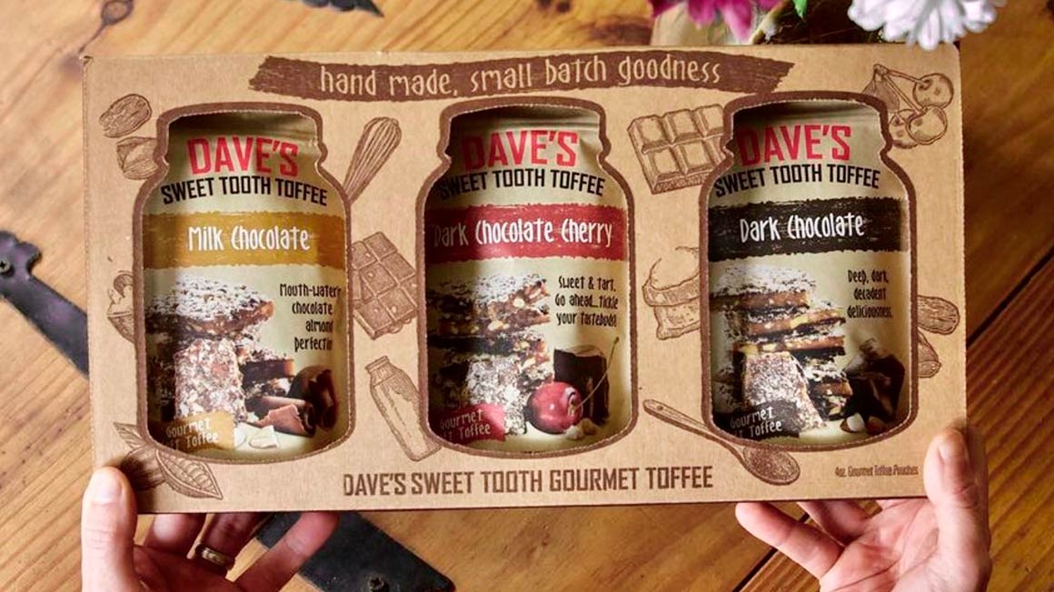 3-pack toffee gift set
Don’t take it from us – listen to what Dave's Sweet Tooth has to say...
______________________
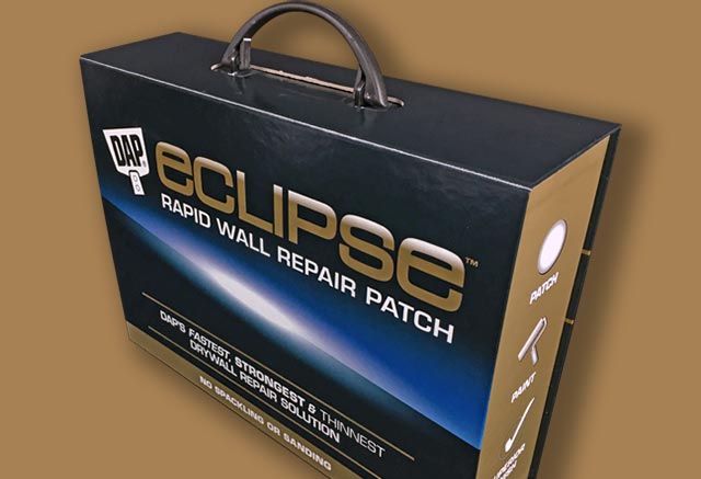
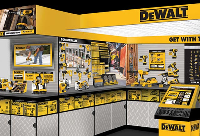
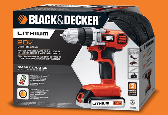
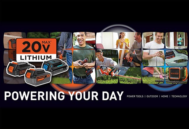
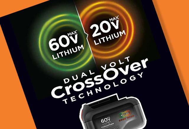
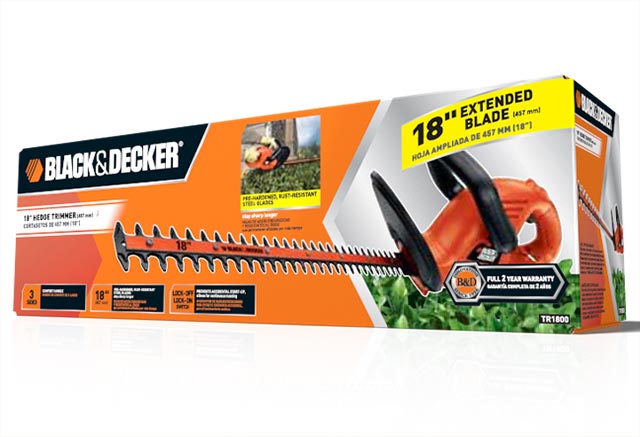
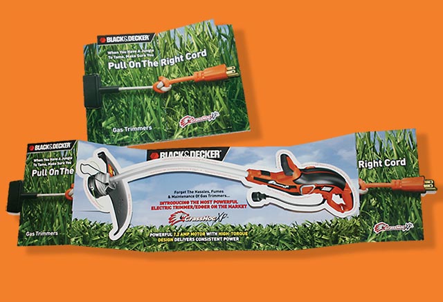
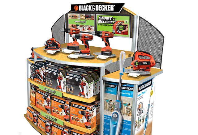
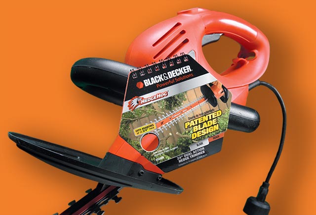
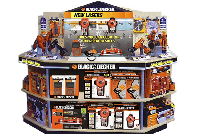
NATIONAL HARDWARE BRANDS
TOOL & HARDWARE PACKAGES BRANDING DESIGN
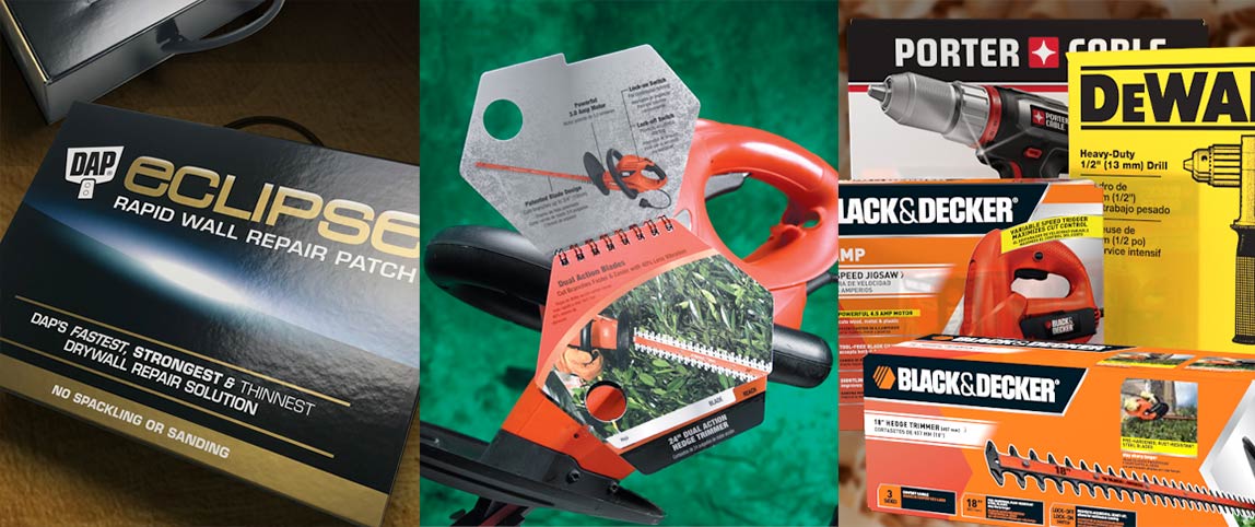
A trusted design source for national hardware brands
While Catalpha collaborates with many entrepreneurs and startups who develop and launch their brands, we also are a trusted source for many top national brands.
Brands that have their own internal marketing teams, designers and production departments that need to go out-of-house for any number of reasons. A bogged down production department, a fresh perspective, design skills they are lacking in-house, structural engineering help.
Catalpha brings 35 years of solid marketing experience to the table, with a full wheelhouse of capabilities when you need it—without the hassles.
 |
 |
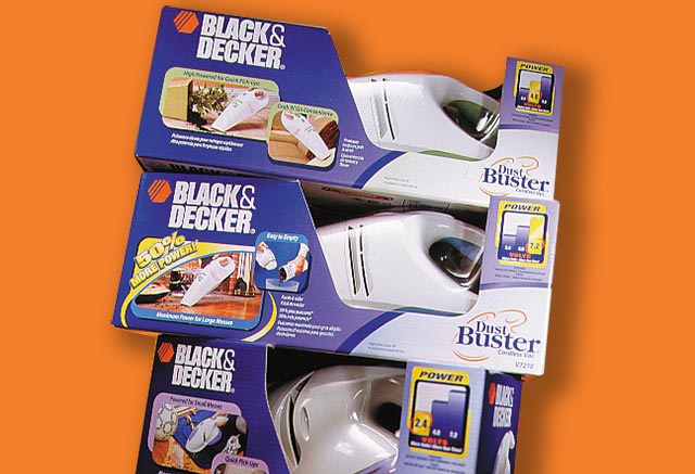 |
A creative ace up your sleeve
National brands like Black & Decker, DeWalt, DAP know the commitment we make each and every time we interact with their brand. A relationship is established that is just a one call away when needed.
Catalpha branding design experience:
- Experienced in adhering to established brand guidelines
- Able to seamlessly integrate with our client’s in-house procedures and design flow protocols
- Ready to pick-up quickly on rush projects when in-house departments get overwhelmed
- A trusted ‘go-to’ whenever new, fresh ideas and perspectives are needed, given our solid marketing and design experience.
- Your confident production resource. Our print production files are second to none—fast, accurate and print-ready.
 |
 |
 |
 |
 |
 |
 |
 |
 |
Our long-standing collaboration with National Tool & Hardware Brands has included:
- POP Concept and Development
- Packaging Design and Production
- New Product Naming / Logo Development
- PR Collateral Development
- In-Store Marketing Material Design and Production
Our experience and reputation has continued to grow as our contacts grow and move to other brands—we are on their call-list when they need to move quickly to get a project done. We are that team.
______________________
DO YOU HAVE A PACKAGE BRANDING DESIGN PROJECT?
Contact Catalpha to schedule a risk-free consultation today.