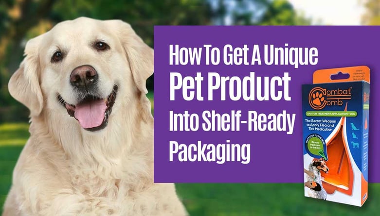
 Follow us as we go step by step through the design and production process for packaging the Combat Comb Pet Product. From our initial structural design and package design concepts through to the final printed package.
Article Contents:
1. Measuring Up
2. Mockup Testing
3. Initial Creative Exploration
4. Dieline Drafting
5. Final Package Production
6. A Successful Product Launch!
Measuring Up
Determining Package Size, Type & Structure
We started by taking careful measurements of the overall size of the product, taking note of its width, length and depth.
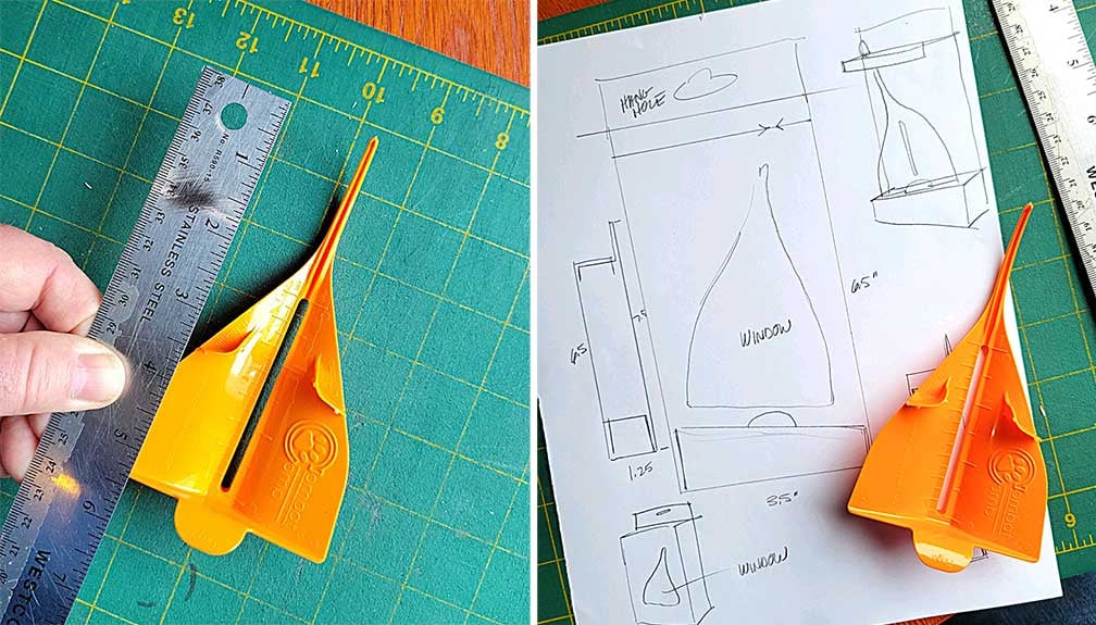
After consideration of the environment that this product will likely be retailed in, it was determined that a hanging box with a window would be the best option for both space consideration and marketing.
Package sizing is kept to minimal footprint and the window allows for a clearer understanding of how this product work while still allowing ample room for branding.
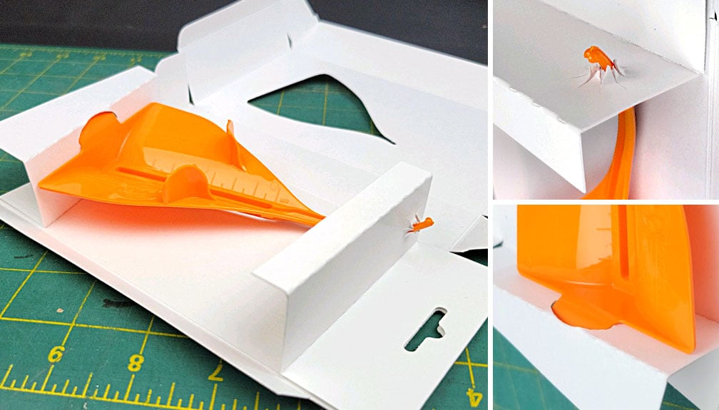
Next we worked out an idea for how creating the inner structure that will hold the product in place inside the package. A fold-in angled platform on the bottom to rest the comb on plus a folded inner flap on top to hold the nose appeared to be an option to securely hold product in place behind the window.
Our measurements and sketches will take us to the next step.
Mockup Testing
Checking Fit & Structural Integrity
Using our notes and measurements, we trim out a rough blank prototype to further test our design and structure. This physical mockup allows us to experiment and help us iron out sizing, stock weight, and the necessary folding for the inner workings that hold the product.
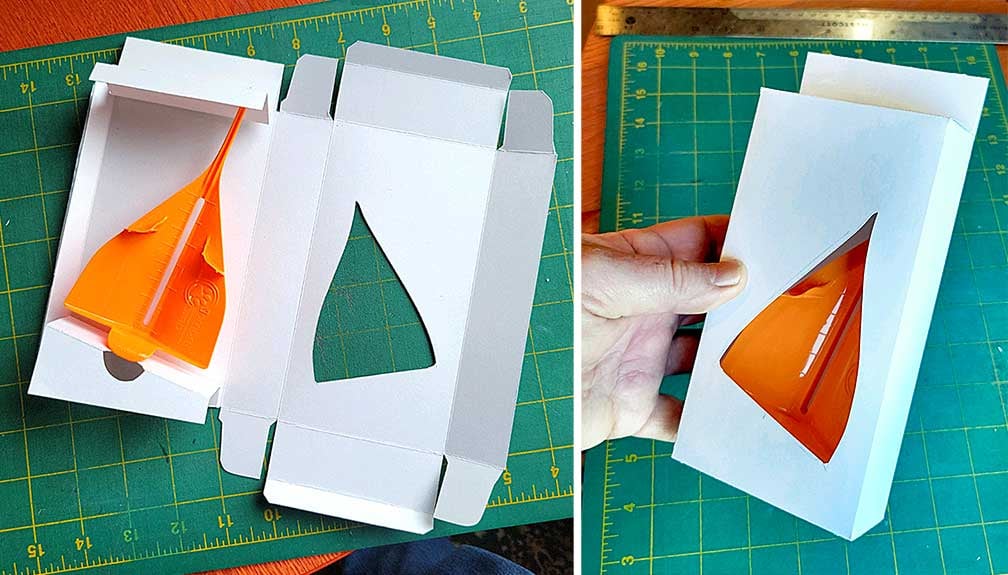
This process took several iterations to work out the angled inner structure before it was tight and secure. Window sizing and position is also worked out and the structure checked for structural integrity. The end result is successful and we can move forward to the design phase based on this package.
Initial Creative Exploration
Designing Visuals for Client Review
This is where the real fun begins!
The purpose of our initial design concepts will be to present to the client several different visuals looks, as well as variations on copy and messaging points.
Since this is a new product for a new company and for a new pet product category that most shoppers will be unfamiliar with, our design strategy needs to make this package
1- Jump off the shelf
2- Clearly let shoppers know what the product does and how it benefits them
3- Create a solid branded look for the Combat Comb
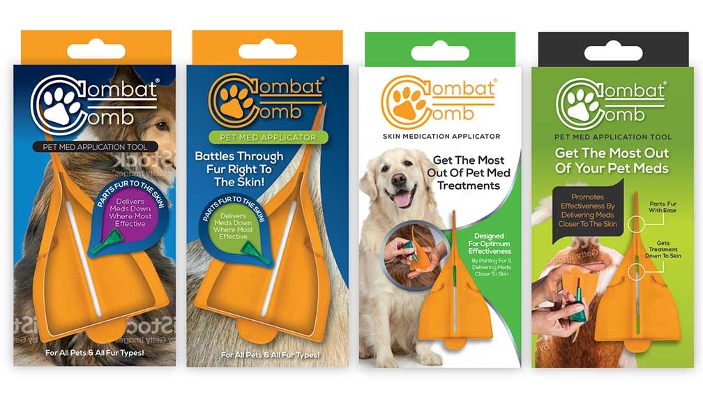 We start by developing designs that utilize our preference for having a window on the front allowing the actual product to be seen. With this window, space on the cover is at a premium. We also decided to present some options that did not have the window in order to gain more space for features and benefits. On all, and logo and descriptor are kept prominent.eye-catching photography is incorporated and colors are chosen that play off the bright orange of the product to engage shoppers.
Callout is used to draw attention to the main product benefit - that this product parts the pets hair in order to get the medicine down to the skin. This needed to be very clear and our designs incorporated various visuals and graphic treatments hit this home.
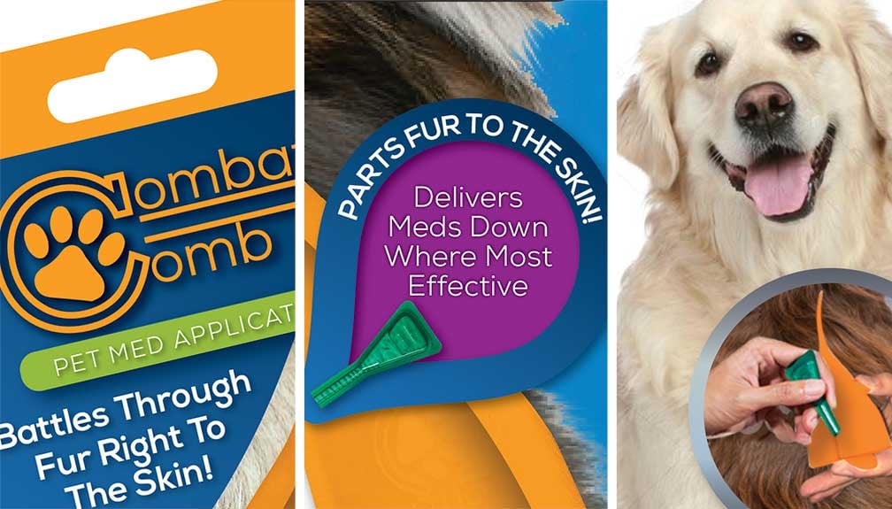
Different product descriptors and benefit statement options used in these layouts for client feedback to see what might resonate most with their target audience. These four design concept were presented to the client for their initial review.
Dieline Drafting
Creating Digital Dieline for Print Production
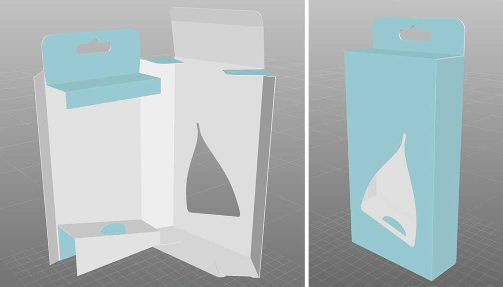
With the designs out for feedback, we began to draft the actual dieline that will be needed to layout the package for final printing. Starting with a basic tuck-flap box dieline, we carry over the measurements from our initial sizing and mockup tests.
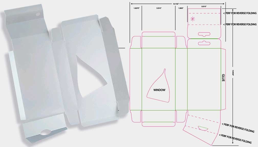
This dieline is then modified to add the bottom platform that will fold inward to hold the base of the comb in place, as well as the modified top that will create the hang tab and folded insert that will hold the tip of the comb.
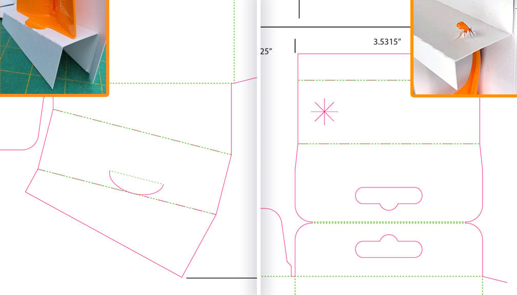
Care is taken in creating an accurately sized dieline that accounts for proper folding, paper weight and print feasibility. 3D software is used periodically to check the final dieline for accuracy.
For more on dieline development and layout check out our blog:
Step-by-Step Package Dieline Tutorial [with videos and downloads]
Final Package Production
Laying Out The Full Package On Dieline For Print
The client has chosen one of the layouts with edits to move forward with and we begin laying out the full package on our dieline, working in the modifications from our client feedback.
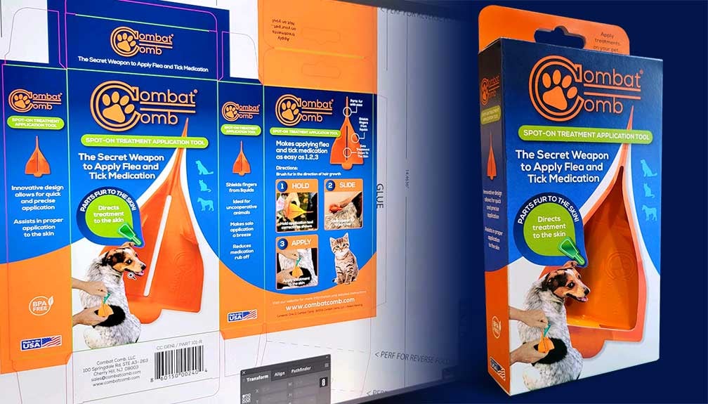
The window idea was a go! Product descriptor and main feature/benefit copy finalized with the main feedback being that while dogs were the main target, other pets should be represented.
The other panels of the package are laid out. On the back panel, a product walk-around used on one of the alternative initial designs was used to highlight the comb's features, and a clear 1-2-3 ease of use section incorporated using custom photography. Side panels repeat logo branding and include secondary feature/benefits.
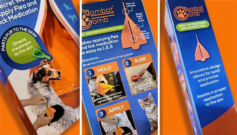
Graphic elements were carefully considered overall. The blue curving background panels on the front visually reinforces the parting aspect of the comb in use and was cleverly placed to sweep from the front over to the sides and back for visual flow. Bright orange accents are used to pop key elements.
3D software was used throughout the process as a check, as what sometimes look great when viewed flat needs needs adjusted for 3D. Our goal was to create a strong, unified branded look for Combat Comb as a product and as an innovative, trusted brand moving forward. The completed package was sent to the client for review and final approval.
A Successful Product Launch!
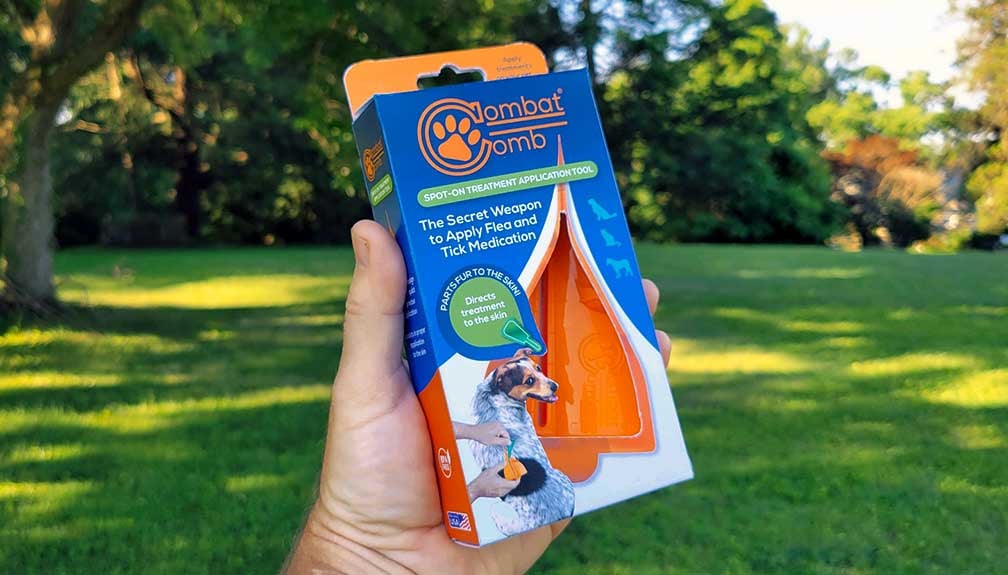
Through every step of Catalpha's creative and production process, we work closely with brand owners and their marketing team to create custom packaging that tells their unique story and give their product shelf presence. The Combat Comb package was ultimately approved and printed and is now in major retailers.
Related Articles:
How To Measure Your Product For A Custom Box [with Video]
Step-by-Step Package Dieline Tutorial [with videos and downloads]
Your Package Should Tell A Story
Fantastic Packaging Designs From Catalpha
Topics: Packaging Design, Design, Package Printing, Branding, Package Copywriting

