Hi. This is Don Keller and I've got a branding minute here for you.
I've got a story about a brand that I saw recently that I really liked and I thought, hey this would be really interesting to the people that come to my site and to my blog and obviously to my YouTube channel.
This story starts here, in the fact that ‘I like pretzels’.
I do tend to snack on pretzels quite a bit, so when I was in the supermarket the other day I saw this new brand and it really jumped out at me.
There's a couple of reasons for that, but I thought, hey here's a good story that people might want to see and understand why I think that's a good brand.
This is about UTZ® Snacks.
Now, if you're familiar with UTZ you may be in my area already. UTZ is a local brand to me.
They do all sorts of snacks, pretzels and chips and popcorn. You name it, they've got it. I like 'em. That's why I was in this particular aisle looking.
They came up with this new brand. This was co-branded for Weis supermarket.
What we'll do is we'll run a video here and you'll see that there is a long aisle of snacks.
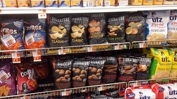
Now, this is obviously going down both sides and you're only seeing one side, but on this side where this signature brand was located they had probably floor to I was going to say ceiling, but the top of the shelf area filled with this signature brand.
Now, that helped make a big impact on somebody in that aisle, that they won't be missing these.
Perhaps if you come out with your own brand of pretzels, or potato chips you might not be able to get quite that much shelf space, but in the case of Weis it was their store, they're going to take up space.
Obviously they want to push this, but I really like this signature brand.
Here's why I liked it.
Number one it was different looking than all the other snacks out there.
All the other snacks had a lot of color in them. In their packaging they were kind of, maybe some of them were even a little on the wild side, but here's this signature brand.
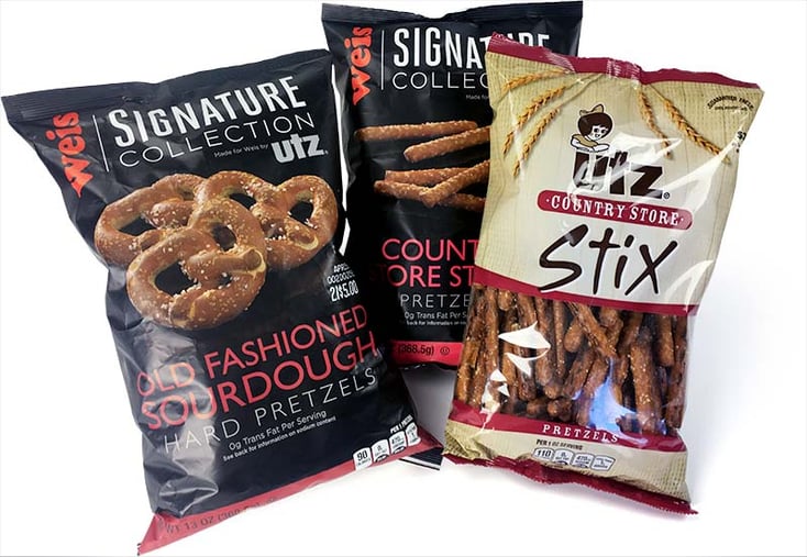
It's in a black package. It's actually kind of like a matte finish. It's not quite as slick as a lot of packages that you'd see out there.
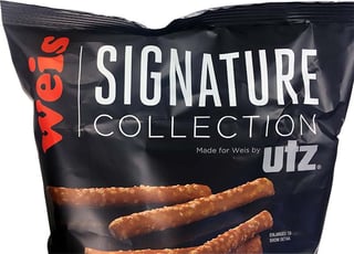 This big bold signature logo. It's simple. It's just a condensed sans serif font. It really stood out against the package.
It also worked well with these two different sizes. You can see it comes in multiple different flavors and styles of pretzels. Mostly pretzels I believe is what it was all about.
Now, the only thing that I didn't really care for on this was the fact they're using a photograph of pretzels here, on their package.
I happen to have one of their other types of bags. This is a different type of UTZ package, but as you can see they've got a window here.
Now I really like the window, just because I can see the kind of pretzels in it and usually the pretzels look pretty good.
You can tell that they're not broken, that type of thing. That was the only thing I've got to complain about, about this style of branded package.
As you can tell, I'm a big fan of these pretzels.
I just want to say thanks to UTZ for doing pretzels, because they do a great job and of course their designers did a good job on this package too, so kudos to them.
I hope you gleaned a little bit of information about branding from this video. If you could take a look at my other videos here and subscribe to my YouTube channel for me.
We'll be doing more of these and I hope you enjoy them. if you do let me know.
Keep Reading. Additional articles that may interest you.
10 Essential Things You Need to Consider When Designing Appealing Food Packaging
Food Packaging Design Secrets For Success
Building Strong Brands For Snack Food Products

