It’s been a full year since the shutdown of Covid. That was when business as we knew came to a halt - last March 15th! We all had to figure out what to do next with our business.
The following Catalpha clients found a way to turn on the steam this past year. Taking advantage of this ‘opportunity’. Yes, an ‘opportunity’, they looked at this shutdown differently because business WAS different.
 |
| New product flavors introduction |
Dave’s Sweet Tooth Snack Food Packaging
Dave’s Sweet Tooth introduced new flavors – Not that their original flavors were getting stale – but adding new flavors gave them something to talk about. And customers ate it up!
Making small batch runs and low quantity digital package printing gave Dave’s a quick way to find which flavors were the winners. Now they ‘Rinse and Repeat’ that process for other new flavors and new sales.
 |
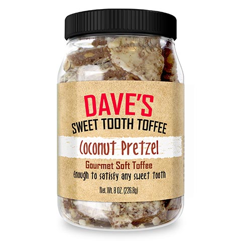 |
| New product photography and an 8oz jar configuration | |
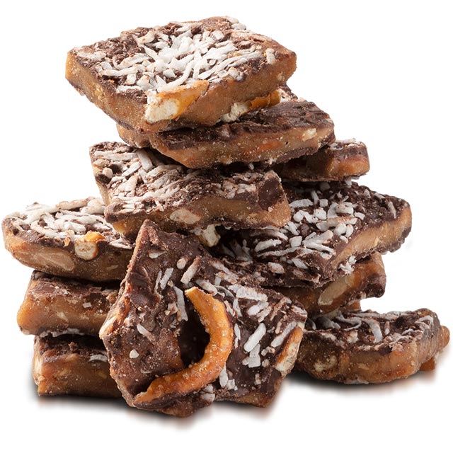
Their jar design pouches (based on the original packaging of using mason jars to pack their product) has become the standard design along with delicious photography of their product and featured ingredients of that flavor.
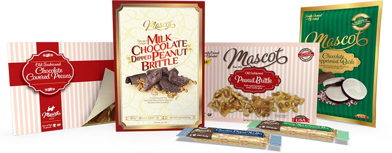
The Mascot Snack Food Packaging
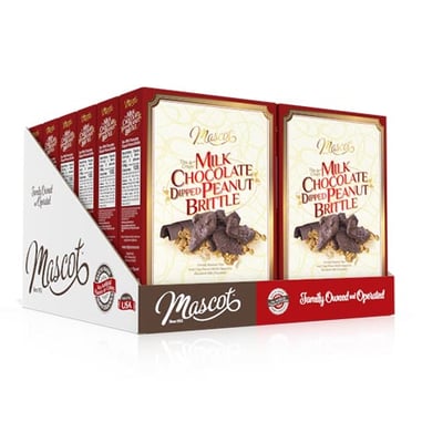
Food and snacks were a big winner this past year. What with more people working at home and closer to their food pantry. This established snack company came out swinging this past year with new flavors, new packaging, and new ways to market on store shelves.
 |
 |
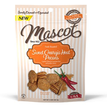 |
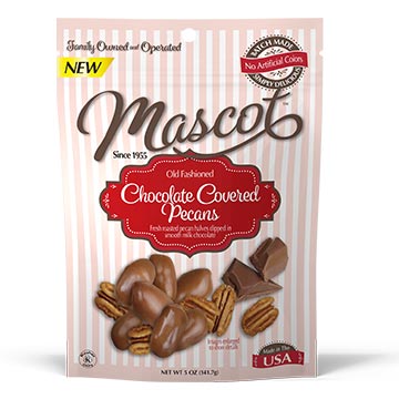
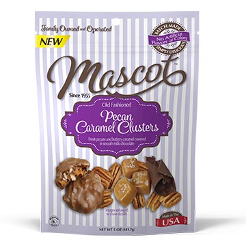
| Updated Mascot candy pouches | ||
Mascot, a family-owned business, and has been making pecan and snack food products for the past 60 years. They are the largest distributor of pecans in the U.S. and operate under the leadership of their third generation!
Their retail marketing effort was undertaken this past year to incorporate internal and buyer input to expand upon a nostalgia design across the entire Mascot product line.
It was important that the design worked across many styles of packaging - boxes, pouches, candy wrappers AND the many different sizes of each.
 |
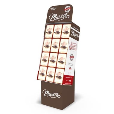 |
| Updated product packaging and in-store point of purchase display | |
Changes to the packaging included a logo and tag lines updated to emphasize their history. Specific icons/seals were designed to incorporate into the packaging to highlight their features of gluten free, Kosher and allergy free.
| Example of iconography used on the packaging |
The client also wanted to emphasize and promote that they are - batch made candies, family owned & operated, and all products are Made in the USA. These important features became icon-like graphics and were used on all packages.
Want Us To Do It All For You?
Best Package For You - We’ll determine the best type and size of package that fits your product and your budget.
Design - We’ll create a design that will stand out from your competition.
We’ll Get it Printed - Don’t be left with a pretty design and nothing else. We can also print your package so you can get it on the shelf and sold!
While developing this approach the objectives were discussed, planned and revised. Product color coding between flavors and a consistent style of product photography were used. The final design utilized a mix of product photography with highlighted ingredients, graphic elements, and a unified graphic family appearance.
It was important that the new design worked across many styles of packaging - boxes, pouches, candy wrappers AND the many different sizes of each.
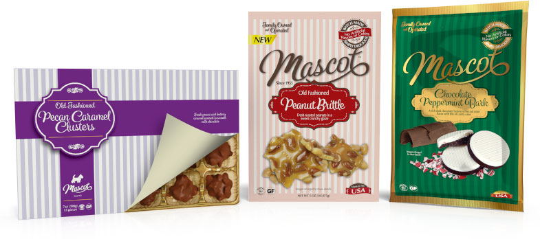 |
| Consistent design across a family of products utilizing a striped motif. |
The ‘striped’ design was also worked into gift boxes, tins and candy nut bar wrappers for this year’s holiday season.
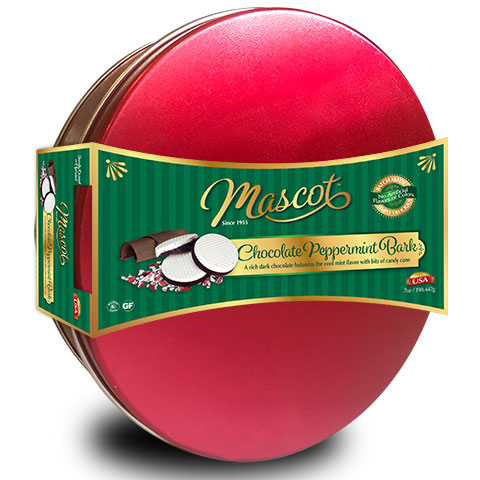 |
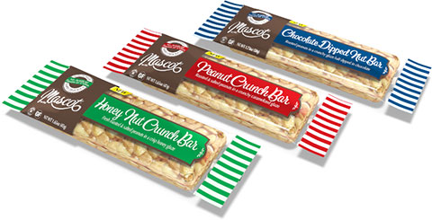 |
| Gift box wrap | Nut bar wrappers |
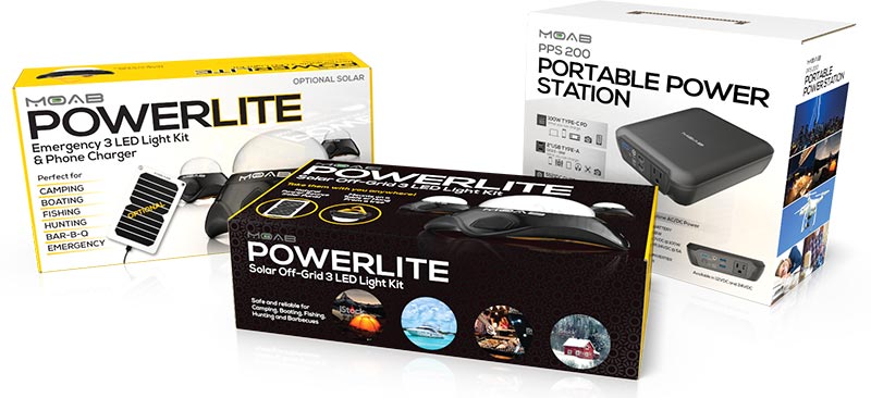
Energy Source Systems Retail Package
Eco-friendly products have been increasing in popularity for some time. This company specializes in products that are not only ecological but are perfect for emergency situations. Think Texas cold snap or the New York Snowmageddon.
This company was a clean slate and had no branding established. Great product photography was used prominently on the cover along with the many images of how & where this product could be used.

CBD TheraReleaf / Pura Wellness Brand and Packaging
Catalpha helped create these brands from scratch. A complete line of Essential Oils as well as CBD products based on 100% organic CBD. You can imagine the work that goes into creating a line of products… Making all the product packaging in multiple variations. Having enough product to bottle. The labeling, storage, shipping, etc! …Whew!
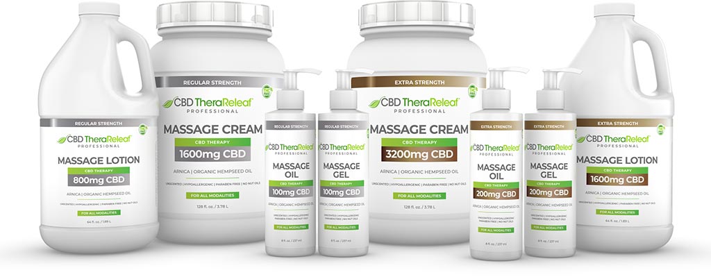 |
| TheraReleaf CBD Massage product line |
Originally, this client wanted a light, white, clinical look. We also started off designing for the future need of having Drug Facts on the labels and packaging.
Not only multiple types of product, Freeze, Freeze-Heat, Arnica, Arnica Plus, but they all came in Oil, Lotion, Spray, Cream. And then there was also Regular Strength, and Extra Strength. And then also a Professional Line and an At Home line! Multiple layers of copy points to keep in mind as well.
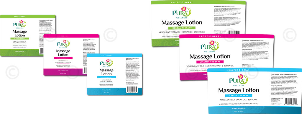 |
| Pura product label variations |
That info all had to fit on labels AND packages.
We started out with different milligrams of CBD strength and emphasized that design for a while til we moved the whole CBD reference into the logo.
This product was certified lab tested. Our client went through all the right channels so that their customers would feel a level comfort and guarantee that this product was tested and qualified.
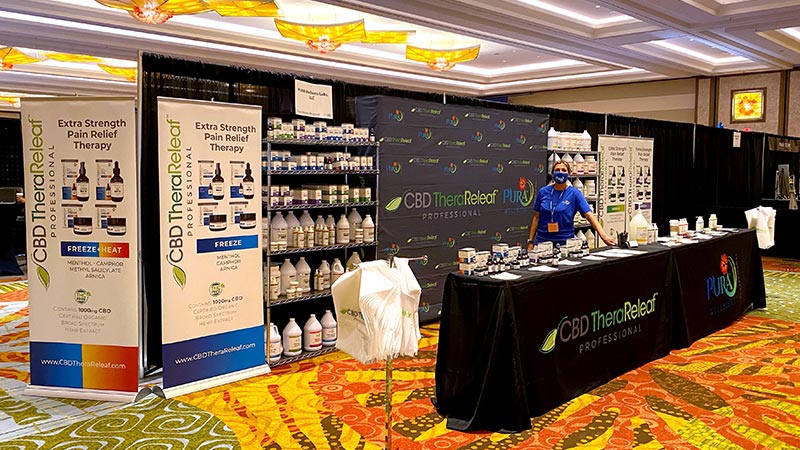
This industry even had a tradeshow this past year, so all tradeshow materials were developed - a booth, pull up banners, handouts, bags, table wraps, and shirts
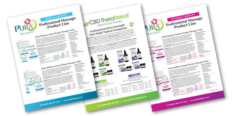
Ads, product sheet handouts and sample packettes were also developed.
 |
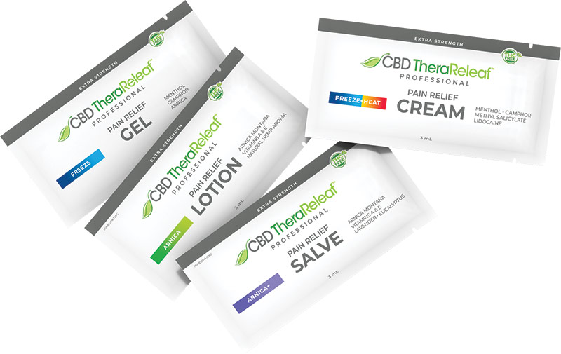 |
| Product sell sheets | TheraReleaf sample packettes |

SilverSmart Masks Brand and Packaging
The perfect Covid product. Here was a New Mask Brand that was not reselling an existing product, but manufacturing their masks in India with organic, locally grown, cotton thread and bacteria fighting silver thread technology. Creating a complete line of mask products to reach the fashion retail markets. We even designed a Shippable Sales Kit to help sell during these ‘No In-Person meeting' sales times. To help market these in-store, a 48 piece point of purchase display was designed.
This package design was approached using the following background info…
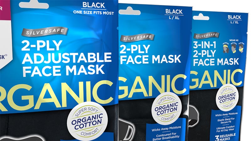
Original packaging was designed by someone in China who didn’t understand the US market. They had all the info all over the package. Just a jumbled mess of copy. No emphasis on anything and difficult to distinguish between types of mask.
Our first task was come up with package sizing for a resealable plastic pouch.
From there, the whole design was done to emphasize the Organic nature of the product. That was lost on the China designs. We had to get that across clearly.
Original packaging was designed by someone in China who didn’t understand the US market.
 |
| Packaging product variations |
Then we came up with a color coding system. We also needed to take into design consideration different styles of masks (Double-layer, triple-layer, three-in-one and fashion masks), and different sizes, as well.
These were new products coming into stores, so the name and brand had to be front and center and not get lost or confused with other mask products.
The brand color was blue. A second swatch of color was used to indicate the style of mask. We also had to show styles of mask, size & mask quantity as well as benefits & features.

Do you want me to do your packaging for you?
Yes, I want Don to do my packaging|No thanks, I'd rather do it myself
Speed was a factor in this design project - this had to done quickly in order to print packaging and fill orders.
We emphasized the company brand with a shield. Which played on the ‘protection’ aspect of the mask.
We also needed to make the packages easy to recognize between styles and size, so it would be easy to stock shelves or displays.
Kids Masks
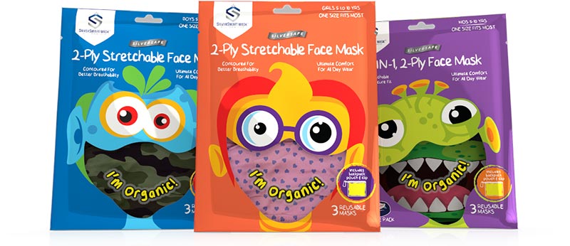
Kids Masks were created and their package needed to appeal to kids. Monsters were a big draw and used because of the fear factor of Covid and child connection. These were also sold with a Pouch and Clip that had to highlighted. The design needed to relate to kids and we wanted kids to say - “Mommy I want that”. That took precedence over the Silver Smart brand so the logo was reduced to make room and emphasize the monster.
 |
| Sales kit sell sheet/booklets |
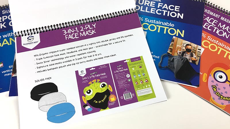
A sales tool kit box was also developed. This NO MEET Sales Kit Box - It’s BUSINESS on the outside - PARTY on the inside! Yes, it looks like business when it lands on the buyers’ desk, but when opened, its an explosion of color and product info. Even a printed flip book to present the Silver Smart story. And room to add sample products and you have a Meeting In A Box. Just add a Zoom follow up call to review with the contact and sales are made!
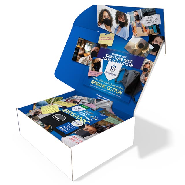 |
| SilverSmart sales kit with insert, spiral bound booklet, and product samples. |
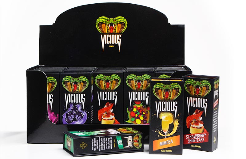
Vicious Vape Product Packaging
Vape Products were still a big seller during last year. And this company took full advantage by creating a new line of flavored vape products with a unique rigid box package and digital content to help market it.
Hit them where they are. Where is your audience? This vape audience lives on Instagram and social media. So images and video were needed to help market their new product. Point of purchase was also needed to display the products in-store.
There is no right time to take the packaging risk. Sometimes you have to make your own opportunity.  to discuss how to start your next project.
Related articles:
The Importance Of Eco-Friendly Packaging For Your Product
The Importance Of Packaging In E-Commerce During Covid-19
Building Strong Brands For Snack Food Products


