Great! - you have a brand, a professional logo, a line of products ready for retail, and a slew of other future products in the wing. It’s time to get those products in packaging ready for retail.
Your products each have feature and benefits unique to their purpose, which will be important to get across to the consumer. They may also need to be in different types of packaging, and in various sizes. They may even be sold in different departments in a retail environment.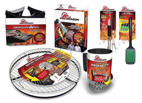
Regardless of all of the differentiators, one thing should ALWAYS hold true—the packaging should always REFLECT YOUR BRAND.
Someone picking up one of your products in housewares, should be able to recognize one of your products sold in hardware.
Collectively your group of products will become the visual representation of your brand persona. This, along with your product reputation is what builds brand recognition and equity.
The package design process for a large scope of products demands attention to detail and planning.
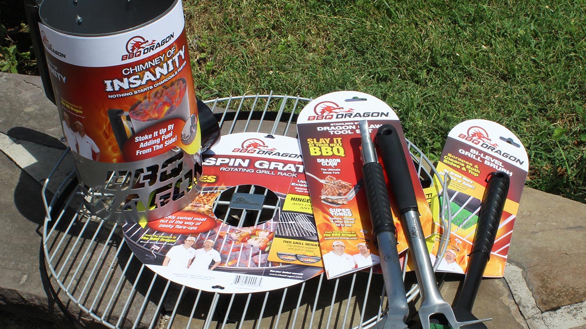
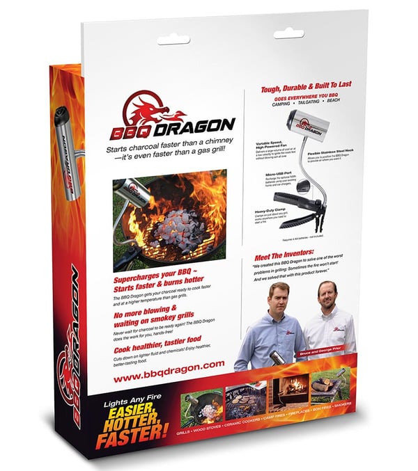
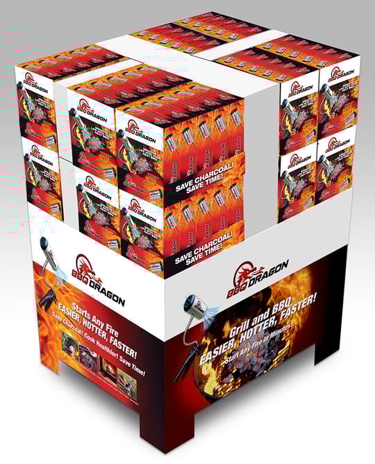
Take for example our work for the product line of BBQ Dragon. The folks at BBQ Dragon initially came to Catalpha for packaging design for the launch of the Original BBQ Dragon - a fire starting tool like none other.
With a growing online presence, a following on their youtube channel and blog, and a break at getting their product into retail stores, the opportunity to build a brand had arrived.
They had a product, a logo, and a story to tell and Catalpha delivered a packaging solution that leveraged their brand across the board.
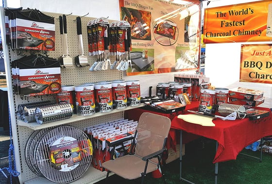
Knowing at the onset that this would need to work for a multi-product line of products was the key that drove many design decisions.
The packaging format had to be: flexible to different package sizes - large to small, adaptable to a wide array of packaging types, from boxes, hang cards and sleeves, and needed to tell BBQ Dragon’s unique story.
Several key strategies that went in to the decisions on the final package format, and by consistent use of these design ground rules, each product would be instantly recognized as a BBQ Dragon product.
![]()
Brand Name Positioning
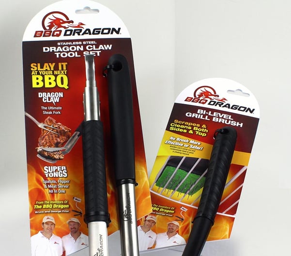
Probably the most important, was the placement of the BBQ Dragon brand logo.
Knowing the packages would have a fair deal of information on the front, the logo would need an anchored spot where it could be easily recognized.
By placing the logo in a clean, uncluttered white band at the top of the package ensured that it would be strong and visible.
Imagery
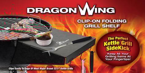
With a name like BBQ Dragon and the brands association with grilling, flames made an obvious choice of a background element that would tie the packages together and be a dominate eye-catching visual element against which all elements would play. Photography needed to be clear and descriptive.

Messaging
BBQ Dragon’s products are unique, and feature/benefits needed to be clear and specific.
These were designed visually AND verbally to connect with the potential buyers needs and pain points in language that reflected the brands ‘stoke it up and get it while it’s hot’ attitude.
Font Choice
Font choice was critical. A clean primary font family, available in a variety of iterations, from bold to light, wide to condensed was chosen, allowing for a wide range of text treatments for callouts and copy points, while keeping a consistent feel.
Structure
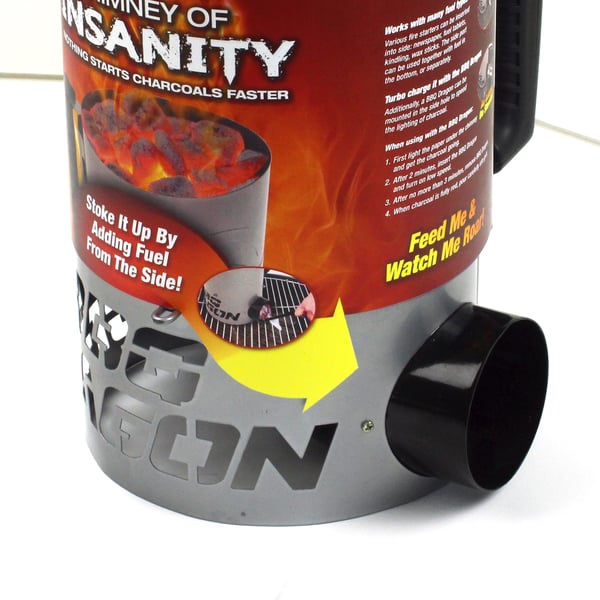
Much attention was given to how each product would be best and most economically packaged, on a card and peg hooked, sleeve over existing box and shelved.
Opportunities to highlight features using the structure itself were incorporated, from the tab on the Spin Grate to highlight the flip up gate, to the die cut arrow pointing to the side fuel access on the Chimney of Insanity.
Have A Story To Tell?
Tell it! Anything that creates your USP - Unique Selling Proposition should be represented.
The two gentlemen that founded and invented BBQ Dragon had a booming social media presence and kudos to share about their product.
So much so that it was worked into the package design right on the font.
So, go ahead…picture that whole retail aisle stocked full of your product, and the overall impression it gives of your brand. If done professionally and with care, you’ll be well on your way to building sweet brand equity!
TAKE-AWAYS
PLANNING -Even if you are only designing a package for one product, that one product will be your brand until others are added.
With some forethought, you can lay the groundwork for a design format that will carry your brand into the future.
TONE - Often overlooked is the tone of your copy on your package. Needing to be clear does not mean it needs to be dry or boring.
The flavor and style of your brand—whether laid back casual, high and tight luxury, matter of fact intellectual—should play a part in addressing your potential end user.
CONSISTENT FLEXIBILITY - With all being said, a package design format for a multi-product brand should not be so rigid that each product gets lost in a sea of sameness. Allowing for the occasional ‘variable’ in your format is perfectly OK and often necessary, provided it’s 'brand worthy’.
Here are some other blogs you may find of interest:
4 Successful Packaging Redesign Stories
BBQ Dragon Entrepreneur Shares His Product Launch Success Story!