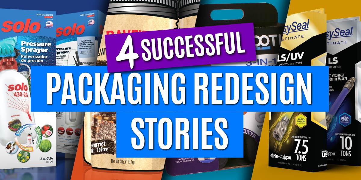
The reasons to redesign your package are varied but they usually boil down to one thing - lack of sales. Whether its an old design that no longer stands out, or your product has ‘outgrown’ its original design because of new features or new competition has entered the market. Redesigning offers you the opportunity to rethink your packaging, bring it up to speed and kickstart product sales.
Of course, that is IF you do it right. Below are 4 packaging redesigns projects. With detailed reasons of why they were undertaken and what insights were used to direct design. Take a look - perhaps there are similarities with your packaging.
NuCalgon Product Packaging Makeover
The Challenge:
NuCalgon Came to us with a unique situation on one of their product lines and the current competitor landscape background.
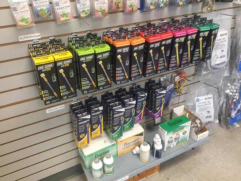
It was apparent the the competition had pilfered not only product offering, but package structure, visual styling, product level coloring and even logo brand treatment!…. to the point that at a retail level, on-the-shelf differentiation between several brands was nearly obliterated.
Having just updated their formula, this was an optimum time to do something about it. They made the wise decision turn to Catalpha Packaging early enough to strategize a total brand shift in updating their packaging to reflect the premium level their product had reached.
It was the opportune time for them to break out of the sea of competitors!

Want Us To Do It All For You?
Best Package For You - We’ll determine the best type and size of package that fits your product and your budget.
Design - We’ll create a design that will stand out from your competition.
We’ll Get it Printed - Don’t be left with a pretty design and nothing else. We can also print your package so you can get it on the shelf and sold!

The Strategy:
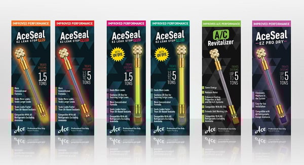
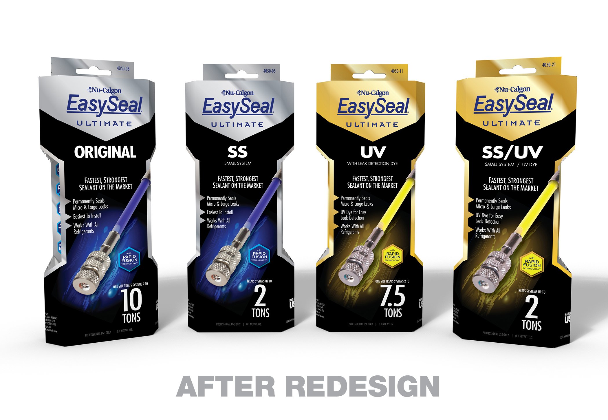
A unique package/branding system that screamed PREMIUM and in a retail setting to be picked up and noticed.
Its beveled structure stands out from the boxy norm and its indented middle begs to be gripped and pick up.
Use of metallic stock + matte inks accentuates the look, the facets of the package catching light on the metallic, countered with matte black background.
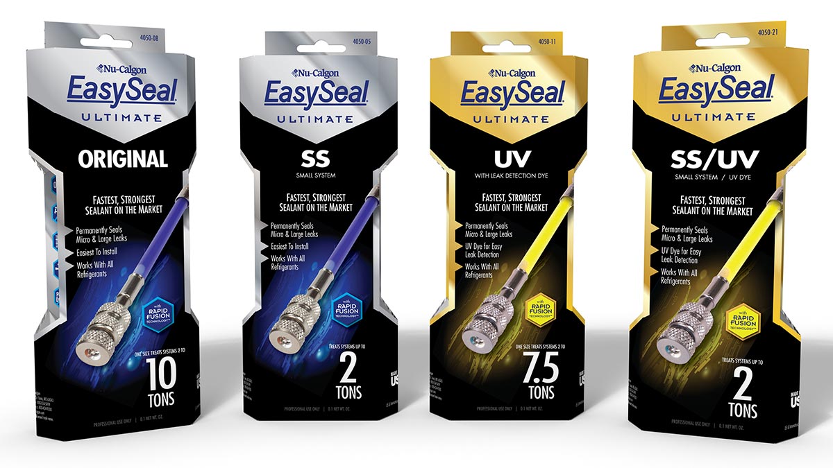
Logo branding shield was simplified. Clearer communication between product levels was defined. Silver and Gold used as a main differentiator between Ultimate and Ultimate/UV, with secondary level titling clearly positioned.
Product photography was re-shot, positioned and enhanced to highlight the advances of their RapidFusion Technology and their brighter UV dyes
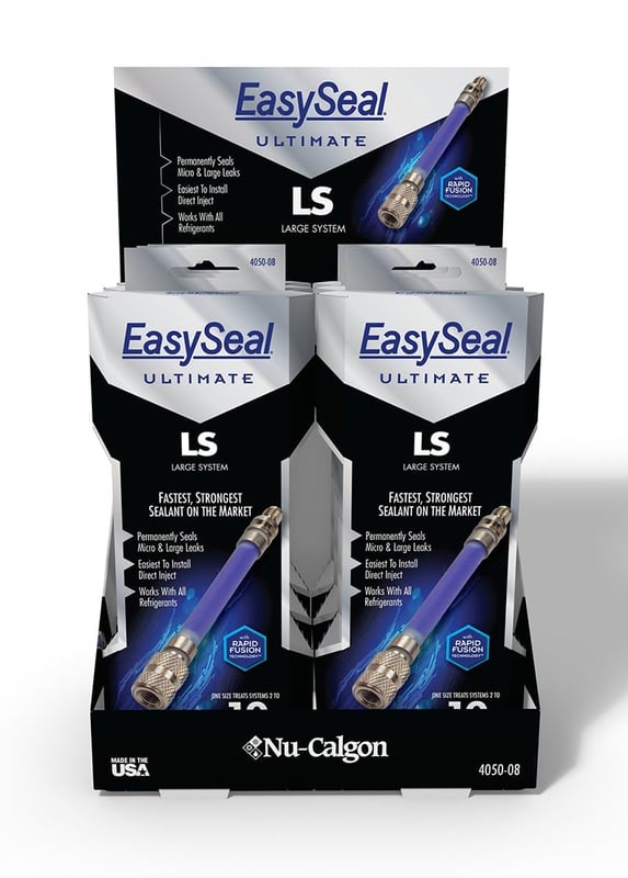
POP was also designed to compliment the package redesign and push sales within stores.
Important take-aways:
• Keep a keen eye on your competitors - not only on product offerings and advancements, but visually at a retail level as well.
• Evaluate opportunities to effectively and/or economically update your brand and/or packaging
• Take the effort to evaluate every aspect of how your packaging/brand interact and resonates with your customer
• Maximize your redesign leverage to push the envelope beyond your competition.
• Collaboration between you and your design source is critical. You hold important keys and information to your particular product/situation (i.e.. competition/category technological advances, past sales tracking, your inventory cycle etc…) that only you know, and clear communication with Catalpha can help leverage that into a successful best outcome.
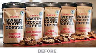
Dave's Sweet Tooth Packaging Redesign
The Challenge:
Redesign to boost sales. Making the shift from online sales to retail, changes needed to compete in a retail, on-the-shelf environment.
A lesson in when you have a product that's main reason to buy to buy is obscured.
Daves Sweet Tooth’s line of gourmet toffee had several things going for it already.
A full line of unique, delicious gourmet toffee flavors, hand made small batches
A unique family story behind the company founding and its current direction under the founders son.
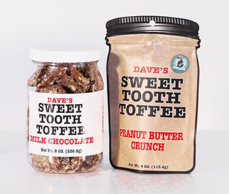
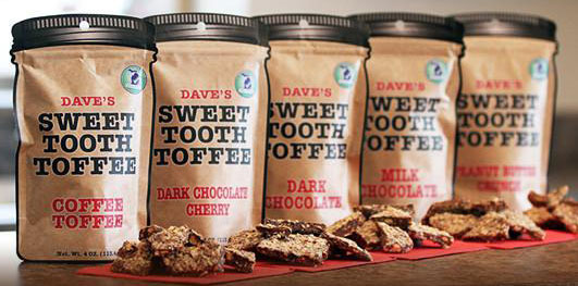
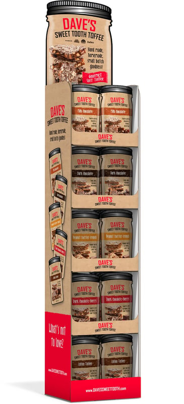
A different take on traditional toffee packaging - using labeled plastic screw cap jars, and carrying that theme to die-cut pouches to carry the look. This ‘mason jar’ look has become an iconic symbol for their brand to this day.
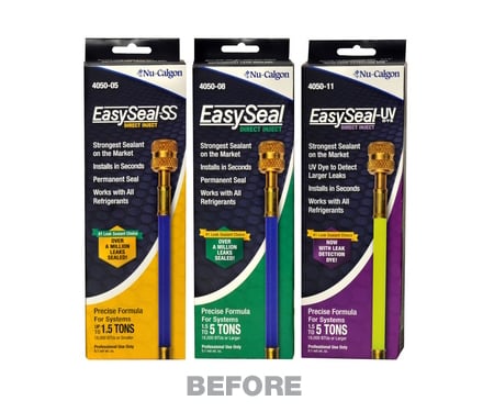
Dave's, however came to us with the desire to expand on their existing pouch concept. The existing die-cut pouches, while unique in shape, had very little in the way of identifying their unique and growing flavor combinations. In addition, they lacked the ‘storytelling’ aspect of what what drives the Dave’s Sweet Tooth Brand.
The Strategy:
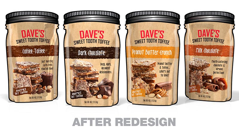
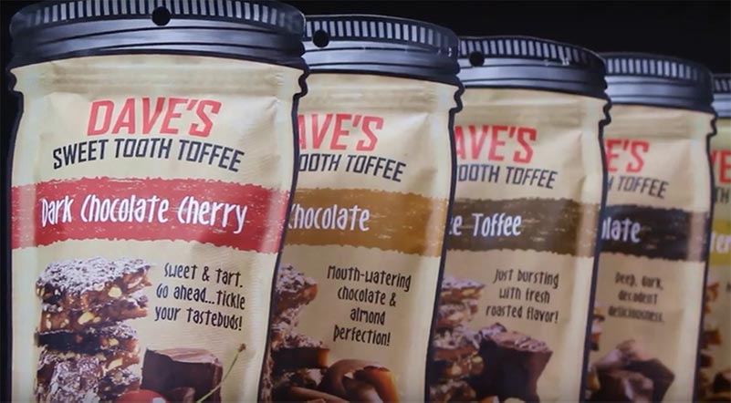
Working within the existing iconic jar shape pouch, Catalpha developed a colorful and descriptive format that calls attention to each unique flavor.
The iconic kraft paper look of the original design was kept, but the decision was made to shift from printing directly on to a kraft stock, to printing full color on a white stock allowing the use of full color photography and branding elements.
Custom photography was done for each flavor, accented by some of the ingredients that go into the mix of each toffee.
A bright color-coded bar tied to the toffee name was added, along with a flavor descriptor that emphasizes Dave's punchy persona and down-home, home made feel.
A flag was added to emphasize that this is Gourmet Toffee, and not your average mass produced toffee.
The overall redesign allowed for each of the unique offerings to shine on their own while holding together an iconic brand look that can be added to as new flavors are developed.
Indeed, since this initial work was completed, several new seasonal offerings were added to the mix, as well as redesign on the full set of labels used on the plastic jars to carry this theme completely through as well as merchandising POP to boost retail sales.
Take-Aways:
• Recognize your products USP - unique selling proposition, and if your current packaging isn’t making the most of it - redesign so it is. It’s Number One!
• Don’t hesitate to hold on to what is working, and elements that reinforce your brands essence. Highlight this “brand persona’ not only in visuals, but in tone of copy as well.
• Develop a look that is flexible and can grow cross platform.
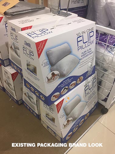
Contour Product Packaging Design Based on their Brand Look
Have the start of a great package but lack the skills or resources to get ‘er done? Don’t hesitate to call Catalpha.
We work with many established clients that already have an established brand look. Many with an existing line products already on the market.
As they develop new products, the need arises to package it in a form that 1) remains true to existing branding and 2) still highlights that particular product’s unique selling point.
The Challenge:
Contour Products a manufacturer and developer of premium contoured products with amazing health and therapeutic benefits.
Catalpha has been an ongoing resource for Contour as they grow their product line. We were initially contacted years ago to help with an initial rebranding in an a strategy to make their product line less ‘medical’ and more comfort/healthy lifestyle, opening up retail channels beyond just retailers that sold medical devices.
Where their products were heavy on the medical jargon and imagery, Catalpha helped guide their transition into a premium comfort/lifestyle brand, usable anytime in any household, by anyone desiring a more comfortable life.
Two areas that we have focused on previous packaging for their products was
1) With a company name like Contour, looking for opportunities in the package structure to make sure each products unique ID and contoured benefits through form itself were as apparent as could be when packaged.
2) Many of these products are in pillow or cushion form, but with there medical benefits might get lost in the sea of normal, commercially available soft goods. There was always a balance on having a look that was, fresh, soft, comfortable, while still getting across each product’s actual health and wellness benefits, without the stodgy ‘medical device’ look.
These are products that you can use day to day, not just use as a medical aid when needed.
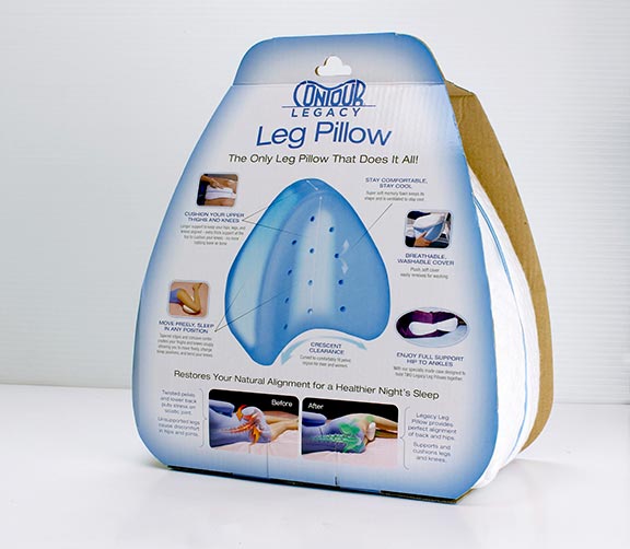
After several successful package design projects, we were called in to tackle the Leg Pillow. Their in-house capabilities got them to a point on a new product that they felt was on the right track, but lacked the professional finish needed.
This particular product was recently redesigned with an improved contoured shape and features. We knew we needed a unique structure that didn’t hide this and a look that went beyond 'medical necessity’ to pure comfort zone.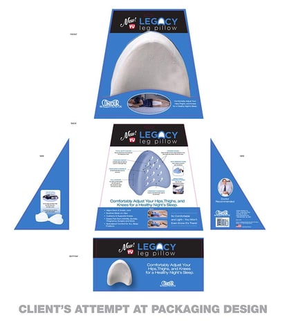
So, Catalpha designed a structure that played off the clients concept of not packaging inside a closed box.
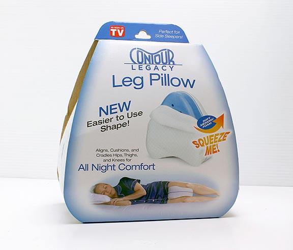
However, rather than having closed sides, we designed a sleeve that using the shape of the pillow, that could stand on the shelf or hang form a hook, and that allowed interaction with the pillow itself through open sides.
From the clients initial iteration of the graphics, Catalpha softened the visuals with more white and a softer faded edge. Simplified messaging. On the front, the logo was reworked for a more premium feel, and a clear beauty shot of the product revealing its heart of memory foam established clearly what the product was. A restful reclining in-use shot shows the all-night comfort benefit. If the consumer still isn’t convinced, we invited them to have a squeeze to see for themselves!
This left the back for the health and therapeutic benefits, and while still a very important reason and benefit to purchase, great attention was paid to keeping them clear and to-the-point, and spread the benefits to include those that are solely comfort-based.
Take-Aways:
• Never hesitate to get a packaging professional like Catalpha involved in your project, even if you have in-house resources.
• It pays to have the knowledge of someone familiar with structural engineering involved when thinking outside the box.
• Look for opportunities to market to other audiences. Sometimes a subtle shift in look and tone will be more inclusive to those not necessarily considering your product.
Solo Packaging Redesign For An Entire Family Of Products
The Challenge:
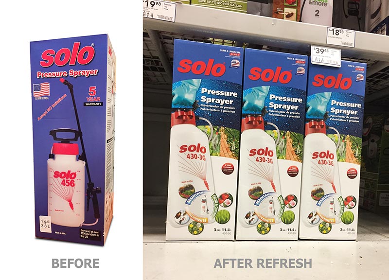
Solo, a leading German manufacturer of agricultural and lawn & garden equipment presented Catalpha with a a multi-task packaging redesign and brand refresh for their US line of sprayers.
With over 30 different sprayers grouped under several levels of use and application, we were tasked with developing a totally restructured visual strategy for their packaging.
Current state of packaging presented several major issues including no clear distinction between product use or application, scattered and disconnected messaging and inconsistent logo treatment and brand identity.
Considerable time was spent with client input on learning the exacting details that separated each sprayer, what points consumers were shopping by, the competitive environment, the clients leverage in the sprayer category, and what had been tried in the past - both failures and successes.

This involved creating a visual identity system that would allow consumers easily compare Solo products and determine which would best fit their needs.
The hierarchy needed to differentiate between
> Category Level - Consumer / Industrial
> Price Point - Good / Better / Best
> Usage/Application
All this in a format that would leverage Solo brand recognition, be consistent, applicable to a wide range of package sizing, and be understandable to the consumer and in a bilingual format.
Color, and iconography played important roles as did ‘layering’ and controlling the amount of details presented, based on the hierarchy of the product in terms of price point and use.
Our package format reading from top to bottom gives the consumer multiple indicators of the level of product they are considering, and where it fits into the Solo family.
First consideration was Brand recognition and consistent use of logo. Solo was currently using several iterations of their logo, some outlined, some with shadows, embossed, etc..
Our solution was to create a anchored home for the logo, in a clearly defined arched shield at the top of the package, large and free from distraction.
Want Us To Do It All For You?
Best Package For You - We’ll determine the best type and size of package that fits your product and your budget.
Design - We’ll create a design that will stand out from your competition.
We’ll Get it Printed - Don’t be left with a pretty design and nothing else. We can also print your package so you can get it on the shelf and sold!
This ’Brand Cap’ allowed for a color change that was used for identifying the Category Levels of Consumer (logo on blue field) and Industrial (logo on black field).
Secondary Indicators for Home & Garden, Farm & Landscape, Industrial/Commercial are indicated by text and color coded flag in upper left corner.
Below the Brand Cap, a textured photo panel was used to further divide product levels… water drops on green for lowest price point products, drops on blue for mid-point products and red brushed stainless for high point commercial/industrial products.
In use images in the band below reinforce the sprayers targeted use. A large beauty of the sprayer being held in hand or on back gives clues to size and capacity.
The final part of the visual strategy is the’ Application Icon Wheel' in lower right corner. Their number and arrangement controlled by product price point… the most icons reserved for the higher price point products and scaled down in count for lesser priced products.
With consistent use, all of these visual elements work together to guide and educate the buyer, helping to sell product in retail environments where sales assistance is often minimal at best.
Take Aways:
• Designing packaging for a large family of related products is possible but takes planning. Knowing ahead of time the full scope of products and issues to deal with is key. All details both strategic and past attempts that can be laid on the table at the onset for evaluation is key
• On a scale this large, consistency is important for consumer understanding, breaking from the format causes confusion
• Be diligent, especially with your logo, to adopt consistent visual usage practices. This builds your brands equity in the eyes of consumers. Many large companies have strict brand guidelines that spell out brand do’s and don’t on everything from logo, font and color use to photography styling.
Still need more info? Try these blog articles:
Calculating the Cost of Product Packaging
Tips To Get Your Product Into The Big-Name Stores
7 Reasons Why You Thought Your Product Didn't Need a POP Display (And Why They're Wrong)