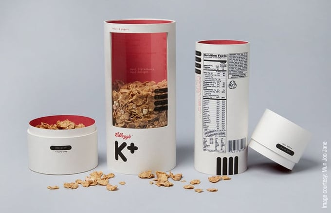
Mun Joo Jane thinks that breakfast cereal needs a makeover. And we thought that anyone that is thinking differntly about packaging deserves a little recognition.
The Los Angeles-based student graphic designer noticed that the largely cartoonish and "saccharine" packaging design concepts largely utilized for breakfast cereal boring. While these bright, whimsical colors and glossy finishes complement sugary children's cereals just fine, Jane felt that adult cereals, such as Kellogg's K+ cereal, needed a more serious and mature design.
In turn, Jane developed two separate product packaging designs for Kellogg's K+, in hopes of communicating a different message for the adult-demographic targeted cereal company.
Generally speaking, Kellogg's cereals are marketed to older individuals that are seeking to live healthy lifestyles. She incorporated these ideas into the first design, making the cereal vessel sleek and cylindrical. To communicate a sense of simplicity and transparency, the front of the cylinder features a translucent plastic window that allows the customer to see the product inside. For the color scheme and label design, Jane used a simplistic black, bold font accented by the classic Kellogg's red, accompanied by a neutral, off-white overall backdrop. The inside of the package features the same red as the logo, and can only be seen as the customer finishes their cereal.
To appeal to health conscious customers, Jane even included a built-in measuring cup using the removable top of the cylinder.
Jane's branding package design makeover proves effective in its simplicity and understanding of the demographic of interest. When looking at statistics, they show that when people look at a website, they only read 28% of the text shown on the page. What helps them decide about a company or a brand, rather, is the overall look and user experience that the design of the site facilitates. Similarly, a company has around ten seconds of a customers' time to convince them that their product and services are worthwhile. The same logic can easily be applied to a physical product. The more simplistic, and transparent a product appears, the more appealing it will be to customers.
By redesigning Kellogg's product packaging design to cater to adults, Jane also made an appeal to the demographic, showing them that she is indeed listening and shaping the product's design around who Kellogg K+ cereal buyers are. This appeal to pre-existing buyers is wise, considering repeat customers of brands spend 67% more than new customers.
Download our free ebook " 5 Things You Must Know Before Starting Your Product Packaging" and get started on your project today!

