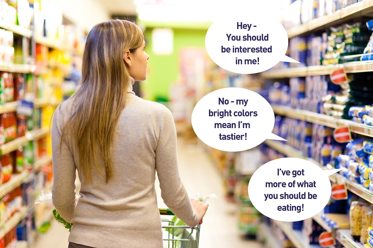
In the competitive world of retail, your product needs to stand out from the other products on the shelf and draw customers in.
It needs to have something that makes it truly special and worthy of receiving the attention of shoppers.
However, to make it really pop on the shelf, it’s important to choose a packaging design that’s professional and gives the right impression of the product. Consider a packaging design that tells potential customers that whatever is inside, will provide the right balance of quality and value.
Striking the right balance, will not just capture the attention of potential customers but will entice them to take it one step further and buy your product.
Not only can the right packaging result in sales coming through right from day one but you will also be in a better position to sell your product in leading retail stores and other prime locations.
Want Us To Do It All For You?
Best Package For You - We’ll determine the best type and size of package that fits your product and your budget.
Design - We’ll create a design that will stand out from your competition.
We’ll Get it Printed - Don’t be left with a pretty design and nothing else. We can also print your package so you can get it on the shelf and sold!
Retail stores care about the standard of the packaging of the products they display and not just the profit margin. Attractive, professional and appealing packaging not only reflects well on the store but also will lead to more overall sales for the store, increasing their profile and garnering them more respect in the retail space.
Let’s take a look at some things you need to consider when designing your product packaging and ensure that it stands out from the shelf and sells more!
Contents:
1. Simplicity is Key
2. Don't Use Generic Designs
3. Keep Your Packaging Relevant
4. Consider Your Color Theme
5. Choose the Right Packaging Size
6. Flavor and Packaging
7. Make Good use of Images
8. Be Honest with your Packaging
9. Convey How to Use Your Product
10. Tell Your Product’s Story
1. Simplicity is Key
Put yourself in the shoes of your customer doing their regular shopping, which they have to squeeze in their busy schedule.
When looking at the products available, the last thing you expect them to do is to spend their time reading the small print, trying to figure out what your product is all about. Nowadays, people simply do not have that time, which means they will look for something different to help them make a quick decision.
They will look for a product packaged with a clearer, more concise message that’s easier to decipher.
If they like what they see and feel that the manufacturer put some effort into creating something unique and beautiful, they are more likely to consider buying the product.
Better packaging suggests to the customer that you really care about the product you are trying to sell to them. Poor packaging tells them you really do not care about the product; instead, you are just offering them a cheap alternative that may not be worth their money.
By keeping the design simple yet attractive, you are telling the customer that you care a lot about the quality of the product and not just about making a sale.
It’s critical to build a relationship with your customer that’s based on trust; both in your company and your product and your packaging is the best way to achieve this.
2. Don't Use Generic Designs
You may feel that a professional design will cut deeply into your profits. However, this is not the case and a professional design should be seen as an investment in the successful future of your company.
Your packaging design is a form of communication between you and your customers. The design you choose is your chance to make a first impression on your clients and you only get one chance at a first impression so it’s critical you make it count!
Using a cheap, generic design conveys a message to the customer that whatever is inside that packaging is likely the same as every other product on the shelf.
Using ‘comic San Serif’ font, an image from Clip Art or free-to-download templates should be considered a cardinal marketing sin if you truly want to create a best-selling product.
You need to ensure your product shines on the shelf, that it stands out from the crowd and makes a lasting impression on potential customers.
On the other hand, choosing a quality packaging design tells customers that whatever is inside is of high quality and that they can feel confident in making the purchase.
Who doesn’t like that feeling of security you get when you’re buying a product you’re confident in? Going cheap and generic when designing your packaging is one sure-fire way to cause people to doubt your product.
Remember, your packaging is an investment and has the potential to keep customers coming back for your product for years to come.
3. Keep Your Packaging Relevant
It’s important to make sure that you use the right design to speak to the market demographic you are targeting.
A design that looks out of place on a product's package or conflicts with how the product will be used will simply not work.
The more specific a design is, the more likely it will attract buyers keen on purchasing something truly suited to their taste.
Therefore, you need to ensure you use the right packaging design on the right product. For example, using a design that would look appealing on a soft drink can would look completely out of place on a beauty product and give the wrong message.
Of course, the conflict will be obvious and is sure to confuse potential customers into thinking what is in the package is not what they really wanted.
The point here is, a packaging design that is relevant to both the product and the demographic will save your customer time and speed up their decision-making process to buy.
4. Consider Your Color Theme
If there’s something that truly defines and captures a person's mood, it’s color.
Different colors evoke different emotions and feelings in people. When marketing your product, you can use the relationship people have with certain colors to your advantage to make your product more appealing.
For example, using dull colors on products that clients do not associate with a dull moment will only serve to push them away. On the other hand, using bright colors on products that clients want to use to convey a somber feeling will make them feel it’s not what they really wanted.
When it comes to products that customers should enjoy consuming and using for joyful occasions such as meals, you should consider bright, warm, or cool colors.
These colors will either make them cheerful or leave a sense of inner peace and fulfillment. When the opportunity arises, you should try to incorporate colors that reflect the natural state of your product.
Most milk packages, for example, will go for white/blue or green/white packaging instead of brown, black, or grey.
White is self-explanatory, green can be associated with the pasture and blue can be associated with water or the sky that surrounds the farm.
These colors evoke the right feeling and bring the customers mind to a place of familiarity with the product. Using a color like orange in milk packaging, on the other hand, will not give customers the same feeling and they will be less likely to buy as they won’t associate the color with milk.
5. Choose the Right Packaging Size
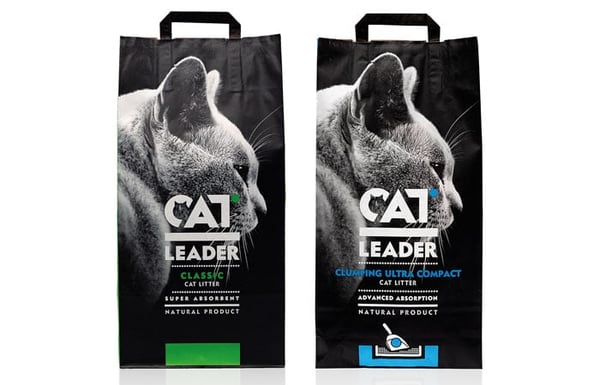 |
| Cat Leader - design by Busy Building ( http://busybuilding.com/ ) |
Customers expect the packaging design of your items to offer protection, as well as making them convenient to transport and store.
In fact, most customers will appreciate the packaging more if it helps them to consume or use the product with ease. This factor alone can help potential customers understand how much you consider their experience in your packaging design.
For you, packaging your product in oversized packages is not a good idea. Be efficient and realistic with your packaging design; bigger is not always better!
You need to create retail packaging design that not only fits your product well but also doesn’t take up too much space on the shelf. A bulky packaging design could cost you valuable shelf-space and depending on the type of product you are selling, could be detrimental to your sales.
Aim to produce a simple but quality packaging design that can give the customer the basic details of what is inside and allow them to carry the product home safely, once they buy it.
6. Flavor and Packaging
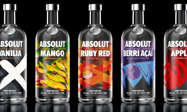 |
| Absolute Flavors design by SuperUnion ( https://www.superunion.com/ ) |
When selling consumable products, you should try to make a connection between the design you use on the packaging, and the taste of the product.
If you can make the customer look at the product and feel as if they can already taste the juiciness or crisp taste of the product, then you just made a sale.
A food packaging design should satisfy the customer's craving and make them feel emotional enough to want to buy your product.
Once the packaging makes the customer crave what is inside, chances are they will make an impulse purchase, which is one more sale for you.
Furthermore, if they like what it tastes like when they consume it, you can be sure that they will come back for more.
Even a brand-new product stands a chance of being bought on the first day it lands on the shelf if its package sends your customers the right signals.
That’s why we have Fanta colored with an orange color, reminding us of the orange taste, while Sprite packaging, on the other hand, is predominantly green, a color we associate with freshness and nature, letting customers know the drink will be refreshing.
7. Make Good use of Images
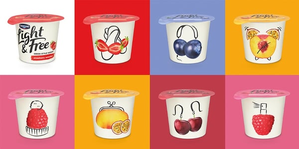 |
| Danone Yogurt - design by Dragon Rouge ( https://www.dragonrouge.com/ ) |
You will need to make good use of images when designing your packaging. Instead of using three words to tell the customer what is inside the package, an optimized image with a white background can do a great job for you.
When it comes to packaging design, the old adage ‘a picture is worth a thousand words’ holds as true nowadays as it ever did.
Not only will the right imagery tell the customer what is inside, it does so with the added bonus of telling the customer what they can expect when they open the package.
You could use a thousand words, or more, trying to give the best description of your product but that one image will do the job for you.
8. Be Honest with your Packaging
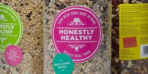 |
| Honestly Healthy - design by &Smith ( http://andsmithdesign.com/ ) |
Almost everyone has had that one experience where you bought something hoping it was going to be exactly what appeared on the packaging.
You then got an unpleasant surprise when you opened it later at home to find it didn’t quite meet what was promised.
While false advertising may have worked to garner customers in the past, today such a practice will quickly get your products banned from most stores.
Furthermore, the sales you make from trickery like this will not make you a leading brand and will sink your product before you ever get in on the shelf.
To become a leading and profitable brand you need to build a base of regular, loyal customers who come back for your products time and time again. You should, therefore, make sure that your customers know exactly what they are buying and that they can trust your company and your products.
Build a positive, trusting relationship with your customers from the beginning and they will remain your customers for a long time to come.
9. Convey How to Use Your Product
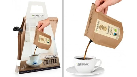 |
| Grower’s Cup - Design by The Brew Company ( https://brew-company.com/ ) |
Some manufacturers and merchants forget to provide adequate instructions on how to use a product. While it may seem obvious to you on how to use a product, it may not be the case with a new customer.
Even something as simple as opening the product can ruin the customer's experience if this is their first time to buy.
Use your packaging to convey a simple, straightforward message that tells them everything they need to know about how to use and if necessary how to unpackage your product.
A negative experience with your product or packaging early on can easily stop a customer from buying your product again.
However, with clear instructions such as how and where to open the product's packaging, will make their first experience with your product a good one and entice them to come back for more again in the future.
10. Tell Your Product’s Story
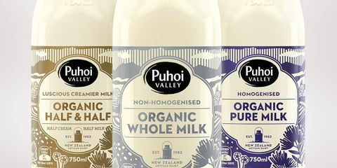 |
| Puhoi Valley Milk - Design by Unified Brands ( https://www.unifiedbrands.co.nz/ ) |
When it comes to connecting with your customers, your product’s packaging design can be a powerful tool.
Human connections are at the heart of every successful business and having a strong, open line of communication with your customers is critical to building trust in your brand. It’s important to recognize that you are dealing with people.
Telling your product’s story through your packaging design will not only bolster your relationship with your clients but will also give them some background on who you are as a company, what you stand for and what your business ethos is.

Want Us To Do It All For You?
Best Package For You - We’ll determine the best type and size of package that fits your product and your budget.
Design - We’ll create a design that will stand out from your competition.
We’ll Get it Printed - Don’t be left with a pretty design and nothing else. We can also print your package so you can get it on the shelf and sold!
Use text and images on your packaging design to tell your customers WHY your company came to be, WHAT needs your product is aiming to meet and HOW it can benefit the customer. Show customers how your product will add value to their lives and be sure to use a design that will be well-received by your target demographic.
Maintain transparency, keep your message clear and concise and be direct when telling your product’s story and communicating with your customers to make your product stand out on the shelf, build a trusting relationship and increase your sales.
Let Your Packaging Sell Your Products
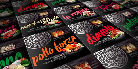 |
| Pizza Express - design by Bulletproof ( http://www.wearebulletproof.com/us/ ) |
A product’s packaging design matters more than you might think. This is your opportunity to make as positive a first impression as possible on your clients and build trust in your company and your offerings.
One look at a great packaging design can quickly convince a customer that the product they just glanced at is exactly what they need.
When compared with other similar products on the shelf, you need to ensure that your packaging design conveys a clear message and gives the customer the information they need so they can make a quick decision.
With the right color scheme, great use of images, due consideration of the packaging style and size and an honest approach, you can ensure that your product stands out on the shelf.
And with your product standing head and shoulders above the rest on the shelf, you can be confident that you will sell more units and your company will enjoy a long and successful future in the retail world.
Leave us a comment below and tell us what makes a product stand out to you!
Other blog posts you may like:
Follow This 10 Step Process To Create Packaging That Sells Your Product
Calculating The Cost Of Product Packaging


