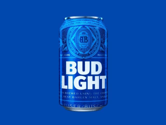
The New BUD LIGHT Package Design Soon To Be In A Store Near You
Next time you hoist a cold one, think about this: Marketing beverages is a difficult business.
The selection is so varied and there are so many beers to choose from on the market today that simply going to the store can be overwhelming.
Every box showcases bright colors, catchy slogans, and other forms of custom product packaging meant to seduce run-of-the-mill beer drinkers.
Beer marketing needs to be incredibly focused.
The industry’s audience can be fairly transient at times and will move from one beer to the next without hesitation.
The creativity of beer marketers is vitally important in order to turn first time buyers into repeat customers.

Want Us To Do It All For You?
Best Package For You - We’ll determine the best type and size of package that fits your product and your budget.
Design - We’ll create a design that will stand out from your competition.
We’ll Get it Printed - Don’t be left with a pretty design and nothing else. We can also print your package so you can get it on the shelf and sold!
Bud Light has been at or near the forefront of custom product packaging that reflects what their customers expect since their inception in 1981.
Bud Light knows that in order to hang onto their share of the marketplace they have to put forward a product that will be in line with today’s beer drinker.
Since Bud Light continues to command the majority market share, they have been very successful in moving with their customer throughout their existence as a company.
This started in 1990 when they shortened the ‘Budweiser’ to simply ‘Bud’ on their cans, and continued when they placed their logo vertically on the can.
The color scheme then added blue to the label between 1998 and 2001, with the next iterations of the can becoming almost solid blue.
The logo started to shift back to a more horizontal plane in 2008, and in 2013 Bud Light was available with either horizontal or vertical logos on their cans.
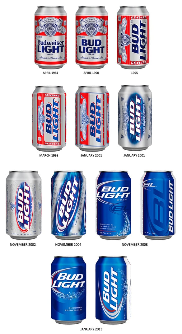
Rebranding BUD LIGHT Through The Years
One thing never changed about Bud Light’s cans, however. Yes, they got rid of the Anheuser-Busch logo in 2008, but they never got rid of any of the red on their cans.
Today, their custom product packaging no longer includes red but has re-emblazoned the Anheuser-Busch logo onto the can.
Bud Light’s decision to shift to solid blue while adding their brewery logo was not done by accident.
Their marketing has also seen a push to include Bud Light’s impressive brewing credentials. The new can will feature various markings that are meant to romanticize the brewery’s passion for crafting beer.
Moving towards a more stylized custom product packaging is one way that Bud Light is attempting to connect with a wider market.
Bud Light’s sales to retailers fell significantly last year, and in order to truly come back into favor with their customers they’ll have to grow their base.
While they remained the dominant brand, they know that they need to continue to expand their brand.
With more and more small craft breweries popping up across the United States, it’s no wonder why Bud Light has adjusted the artwork on their cans.
Many other beers on the market tend to have highly stylized cans and bottles that truly give their customers a sense of what they want their beer to symbolize.
These smaller breweries have to do something to compete, and custom product packaging is one way they accomplish this.
This is also the reason Bud Light’s brewing credentials have been included on the can.
The inclusion of the care and attention put into the beer itself is meant to reflect how consumers today view beer.
Today’s consumer – who Bud Light is targeting – cares deeply about the process behind the craft itself. Including this information gives the customer a sense of pride in what they’re drinking.
With the shift in the can’s artwork overhaul, Bud Light is broadening their scope from their drive to attract the younger generation and towards beer drinkers or all ages.
This shift will mean the end of their “Perfect for Whatever Happens” campaign which was geared primarily towards millennials.
Widening the spectrum of their campaign through custom product packaging and a more sophisticated approach may help Bud Light’s image that they “try too hard” to appeal to younger drinkers.
Because Bud Light is a much larger player in the beer market – and especially the light beer market – they have the opportunity to truly seize a larger customer base.
Their brand has been the major sponsor of many live events over the last few years, with plenty of thought being put into turning the attendees of these events into future consumers.
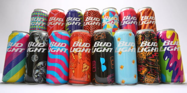
Custom BUD LIGHT Package Designs For The Mad Decent Fest
Bud Light created a very cool set of cans for the Mad Decent fest last summer. There were only 200,000 custom printed cans made for the event, and they are very difficult to find today.
Bud Light also released cans featuring 28 of 32 NFL teams, with each can being customized to feature team logos, colors, and art schemes.
Bud Light’s metal bottles have also been a great way to customize their product. Their bright blue labelling really helps them stand out at a show and the bottles won’t break if they are dropped.
This makes them much safer in a large volume concert setting or a sporting event.
The bottles and cans are sure to be much funnier than they once were. Today’s drinker responds effectively to humor in ads, with Super Bowl ads being the high point.
This is especially true for Bud Light, as they are the beer sponsor of the NFL. Their marketing will need to look professional but also be able to continue their tradition of effectively moving with their customer.
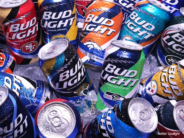
Custom BUD LIGHT NFL Package Designs
This means that not only will Bud Light have to adjust what goes on the cans, but will have to shift how their product looks on the shelf, while in transit on the truck, and even when it’s being consumed.
Custom product packaging is vital for Bud Light in the coming year, and with the right moves they may be able to take an even larger piece of the beer market.
The words on the outside edge of your beer can potentially be the difference between getting a customer and having them move along. Bud Light has known this for years.
That’s why they’ve effectively been able to adjust the look of their beer to reflect their customer’s expectations of how Bud Light should look. Through tight and effective custom product packaging, Bud Light is certain to continue this trend.
Whether it’s through a wider target audience, viral commercials, or simply a can for your favorite team, Bud Light is working to keep their audience engaged for the foreseeable future.
How do you feel about Bud Lights packaging update? Let me know if 'you'll drink to that!' OR it left a bad taste in your mouth. Use our comment section below.
Another rebranding blog post you might like: 4 Reasons Package Rebranding Goes Wrong
Is your current packaging talking to your core audience? Need to get started on your own custom packaging? Download our 5 Tips now....


