How does it happen? Was it because of missing information or expertise?
There are 4 reasons why...
1 - Lack of objectivity.
2 - Too many people stirring the pot.
3 - Marketing direction miscalculates the target audience.
4 - Or it can be as simple as poor judgment.
Any one of these factors will cost more than the time and money spent on package development. It will impact sales and brand awareness.
Any company can make missteps – including high profile major brands. I witnessed this when one of our clients decided that the company brand was more important than the product brand.
We worked on the package redesign, questioning the logic of reducing the product brand to a quarter of the size of the company brand.
We advised against it because consumer research had indicated that they did not affiliate the product brand with the company. That was how strong and independent the product brand had become.
The format was changed with company brand dominating the layout followed by product image and the product brand a quarter the size it had been.
There wasn’t any marketing effort to prepare the consumer to this change.
The fall out was fast with significant loss of sales.
The problem compounded as consumers looking for the product brand name began associating it with the competitor whose product name began with the same letter. The competitor’s product name was visually similar and had the same character count.
Within 2 months of releasing the package design with the reduced product logo we were asked to develop another design where the product logo dominated and company logo was 25% of the size of the product logo.
The error cost market share, investment in an advertising campaign to rebuild brand awareness on top of the two designs and repackaging.
The company decision when the product launched was to have an independent brand not marketed as a sub-brand of the company. Changing brand strategy needs more than a package design change.
To illustrate my point let me ask if you know who owns Reese’s? Did you know it was Hershey?
Do you know who owns 7-Up? It is RJ Reynolds.
Many big box stores are producing house brands but do not publicize that they are such. Producing a house brand without identifying it as a Lowe’s brand or supermarket brand is a strategic action to meet their business objectives.
Nothing is produced unless the package and brand fits into a long-term business plan.
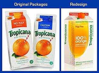 Another redesign story that will be written about for years was Tropicana’s 2009 package misstep.
Tropicana’s package redesign quickly caused a 19% drop in sales. The complete redesign of visuals made it difficult for consumers to find their preferred brand.
The new look didn’t stand out on the shelf because of the change of color, font change for the logo and duller finish.
Just the change of the brand logo was significant enough to lose visibility and damage brand recognition.
In the case of Tropicana, the brand imagery includes the now iconic orange with a straw. That simple visual speaks so clearly what is within the carton without a need for any words.
There isn’t any way to improve the image.
The company used that visual prolifically in all its marketing endeavors. Tropicana’s brand building strategies achieved brand recognition every other OJ company was trying to top.
The orange image alone would be recognized as Tropicana with the word Tropicana.
Why change?
The agency they hired said the CCO of Pepsico laid out the objectives very clearly directing the branding agency to – “rejuvenate, reenergize, rethink, reparticipate in popular culture.”
Keeping your brand contemporary on the surface is smart. Smart marketers take the pulse of their brand awareness regularly.
But did they have evidence that the brand was out dated? Would you, as a consumer, say Tropicana’s carton was out dated?
In all the years I have been branding a key identifier that a brand refresh is needed is diminishing market share resulting in loss of shelf space.
The design rationale for the new look, design guru, Peter Arnell claimed they "engineered" it to "imply ergonomically the notion of squeezing". Hmmmm, what?
The only positive design element is the large claim of “100% orange”. The cap is cute and relates back to the large visual of an orange that use to be on the carton.
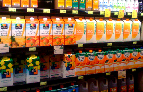
The redesign was on the shelf for 7 weeks before being pulled.
Pepsico responded quickly to consumer complaints and, what hurt the most, the economic impact, $33 million loss of sales.
The Big Lesson Here ...
Don’t change your package or brand without significant evidence that it is necessary.
With a big change, test before going to print. Also consider a soft launch in a small market.
At least see what the new package design looks in retail against your competitors. Tropicana had the financial strength and sales volume to act quickly to return to its original package and regain sales before lasting damage was done.
Let us know your thoughts. Have you seen any branding errors? Use our comments section below.
Our next article will discuss techniques to avoid these pitfalls, “Managing the package development process”.