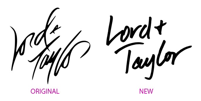
A longstanding luxury brand changes their logo and Twitter lights up with negativity.
Whether you are a loyal customer or not we all recognize Lord & Taylor. I personally prefer the classic script logo. The elegance and flow remind me of the their luxury brand image. It's saddens me when I read a post saying the reason for the update was the 20 and 30 year olds can't read script. Funny that you still are required to sign your name to important documents yet script is thought to be outdated.
It will be interesting to see whether their rebranding has an impact on the brands efforts to be contemporary. The reason to update a logo so drastically is to reinvent and re-engage. Tiffany hasn't felt the need to change tehir look with clean font on turquois box. Coca Cola Classic has kept their look as well.Do you have a strong opinion on these logos?
Does it stand up to the brand impression of make you think of a Sharpee marker?
More Reading:
4 Reasons Package Rebranding Goes Wrong
Brand Analysis Made Simple

