I heard that Snoop Dogg’s new cannabis products were on the market, so I had to take a look. And I was pleasantly surprised. Mr. Dogg has a keen sense of design. The logo while echoing the ubiquitous leaf most others use, has become geometrically stylized. The illustrated accents carry a similar design and add the color to an overall white package. And the gold color accents finish it off and give it a high quality look and appeal.
Take a look at the products Snoop offers:
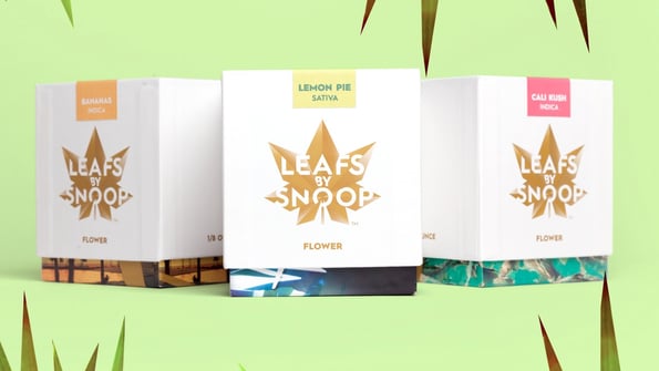
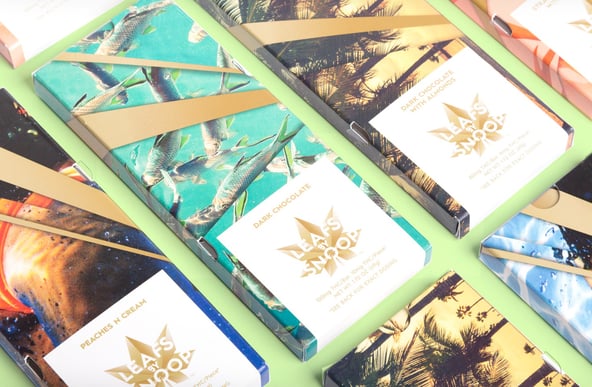
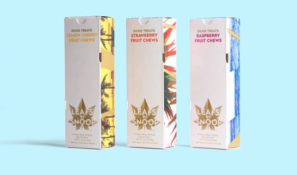
Well done Snoop! Would love to see these packages in person. Guess I’ll have to make a trip to Denver.
Other big names in this market, such as Bob Marley Estate and Tommy Chong are reported to be coming out with their own brand of cannabis products soon. I look forward to seeing their efforts.
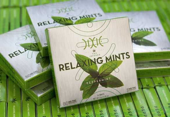
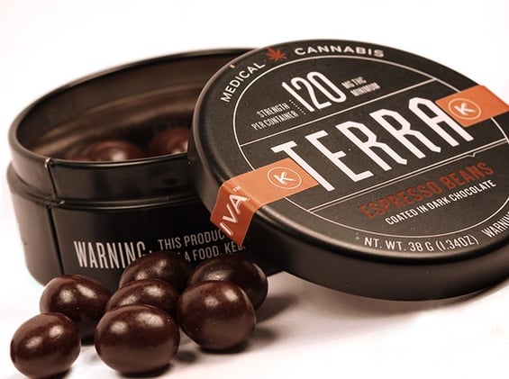
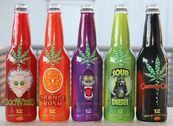
Other makers of packaged cannabis products include the DIXIE company. They offer a variety of cannabis edibles. While many other products and packages are on the market, some took the time to create new packaging to attract their audience while others seem to go ‘standard’ and copy the 60’s/70’s psychedelic look. I’m not privy to sales, so perhaps at this time, design doesn’t play as big a role as other markets but I’m sure that as the market becomes more crowded and competition flourishes, design will play a bigger role. What do you think of the packaging designs for this industry?
